The Brief
Small Storyboards
We watched a short Levi's jeans commercial in class and were tasked with storyboarding it. The commercial was paused at various frames, and we had about 3 minutes to draw each frame. It served as an excellent introduction to storyboarding.
Link to the commercial: https://www.youtube.com/watch?v=fs06oFKuBo0
Later, we learned about different types of camera angles, shots, composition, blocking, and staging. We also studied official storyboards from various movies such as Star Wars, Birds, The Shining, Grand Budapest Hotel, and A Clockwork Orange. I'm quite intrigued by storyboarding, so I did some further reading on the subject when I got home.
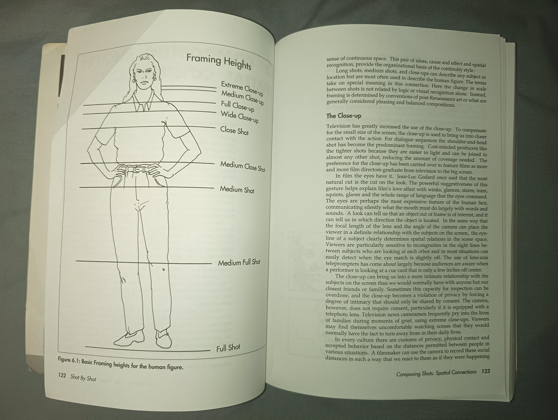
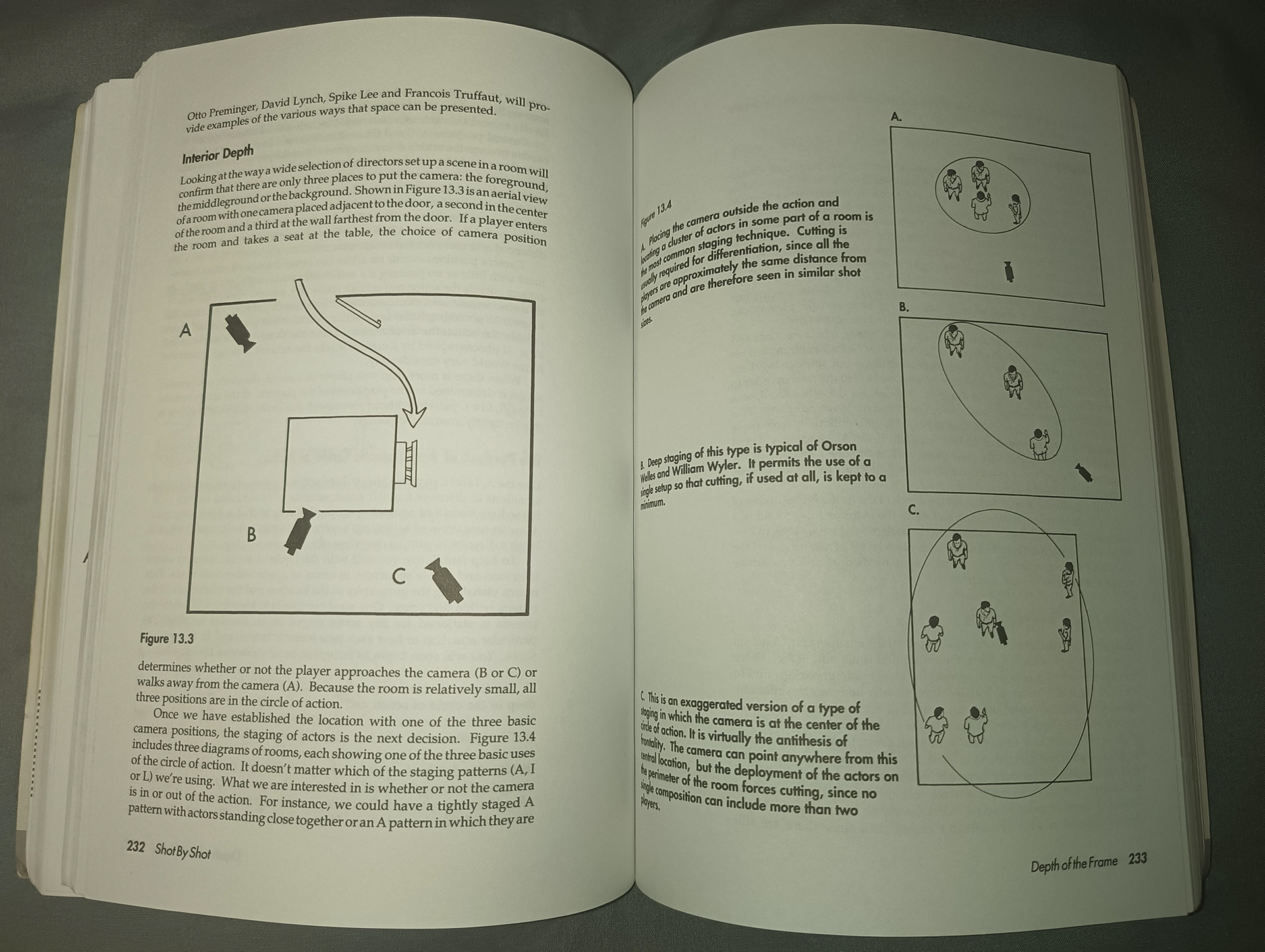
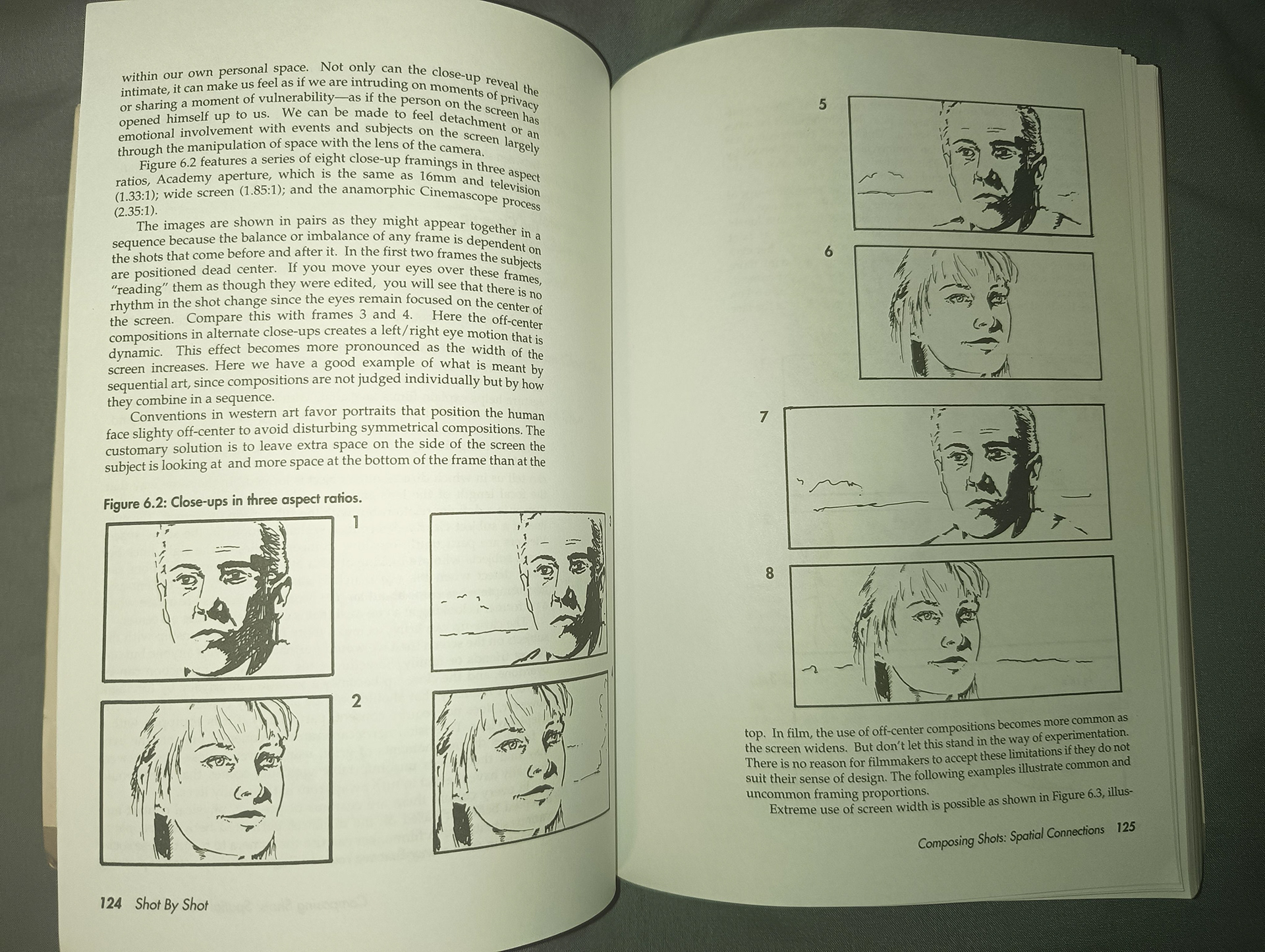
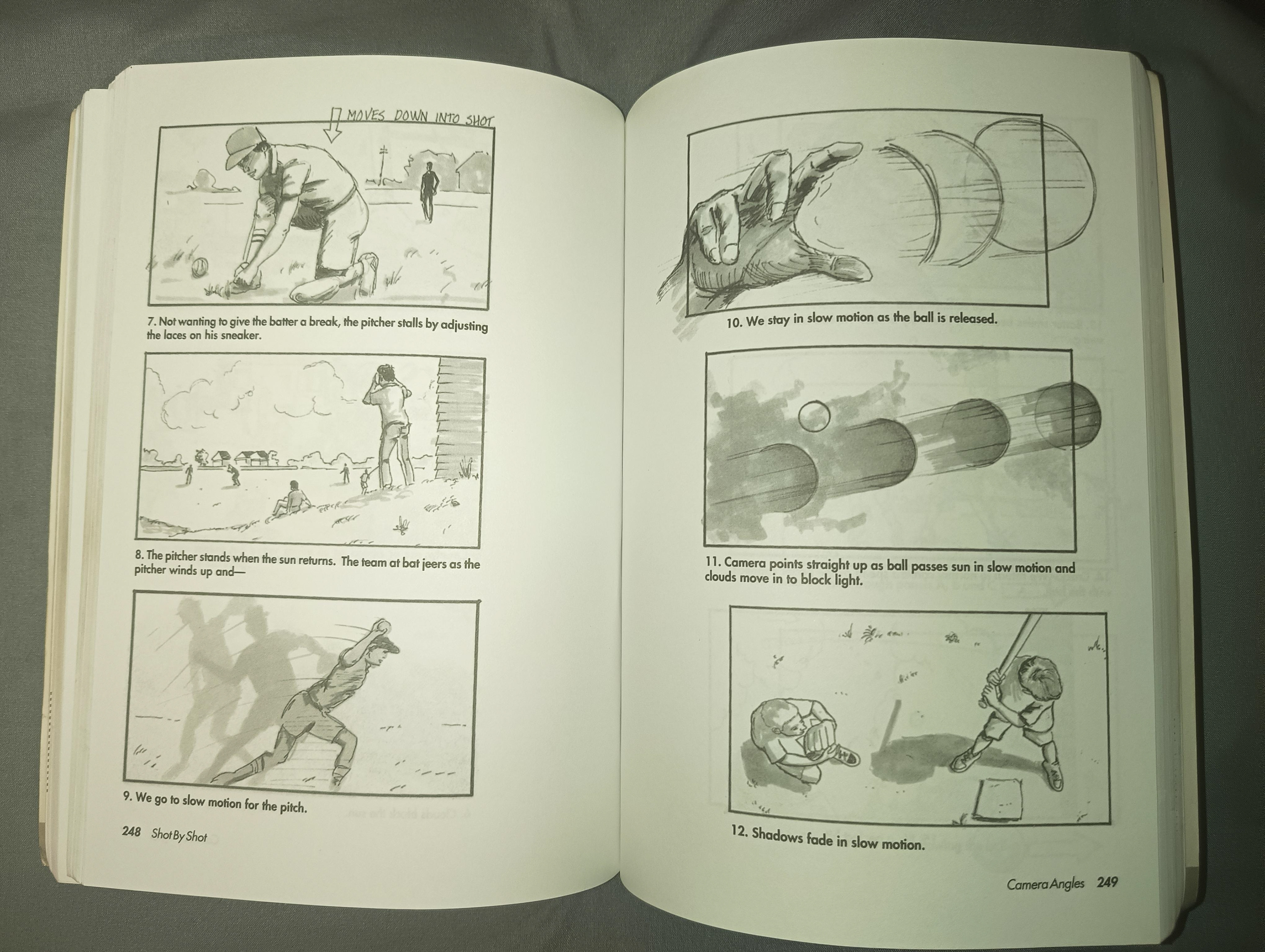
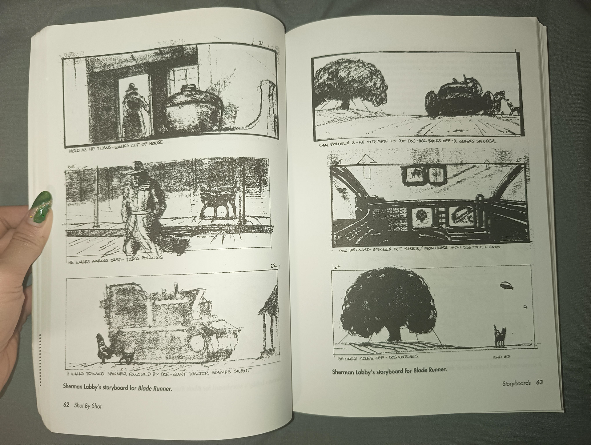
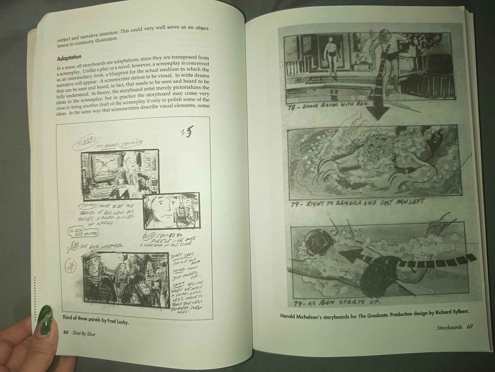
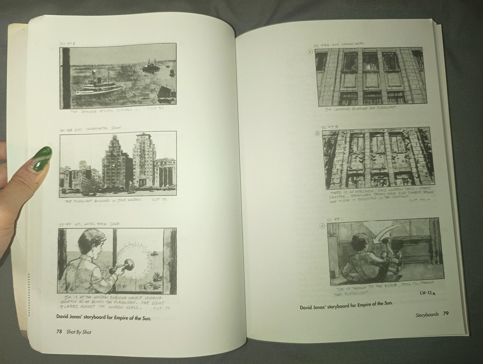
I absolutely love this book 'Film Directing: Shot by Shot' by Steven D. Katz, I purchased from Amazon. It's been so helpful in enhancing my understanding of the technical aspects of storyboarding, including camera angle terminology, shot descriptions, prop placement, and composition. Moreover, it features numerous example scenarios and storyboards showcasing incredible art styles.
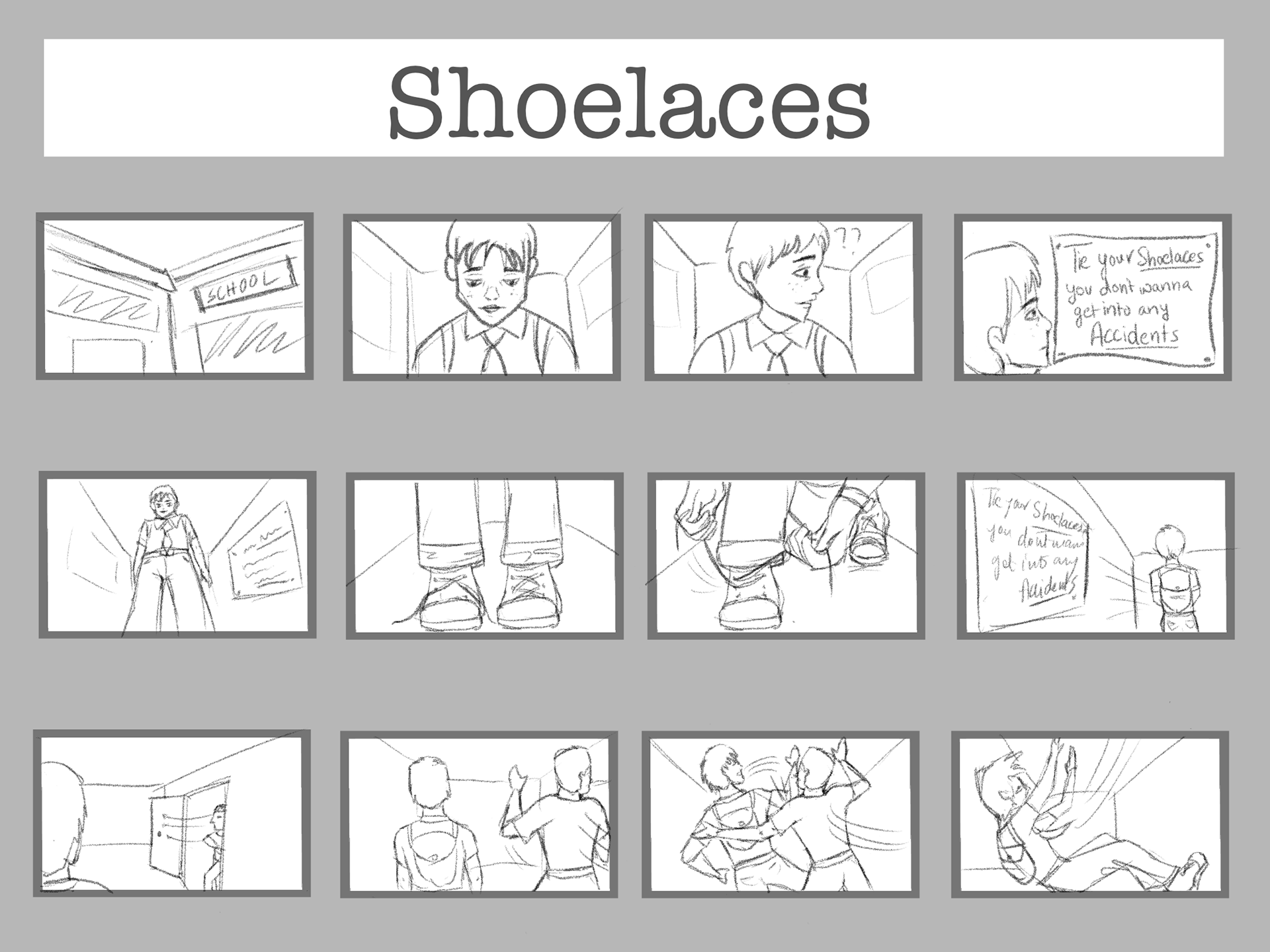
I made up a silly little story on the word 'Irony' and storyboarded it.
I enjoyed the exercise so much that I decided to animate it later. It was a lot of fun experimenting with sounds and getting back into Premiere Pro after not using it for a while.
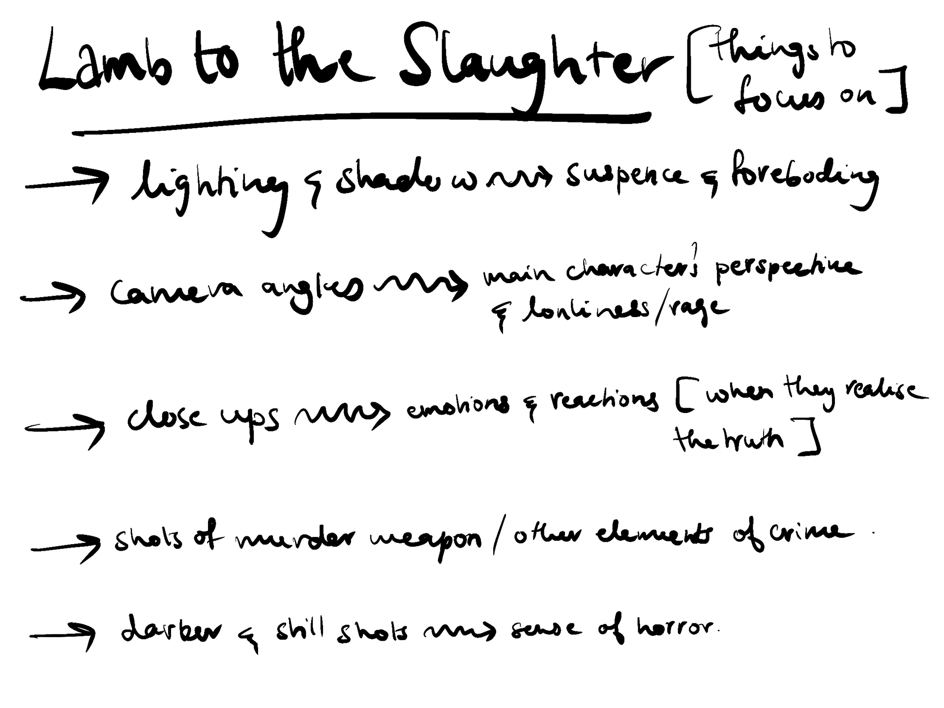
Lamb to the Slaughter- Roald Dahl
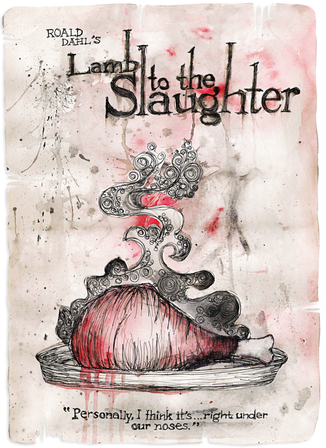
(not my work)
"Lamb to the Slaughter" by Roald Dahl tells the tale of Mary Maloney, a woman who impulsively kills her husband with a frozen leg of lamb after he announces he's leaving her. In a cunning move, she then cooks the murder weapon and serves it to the investigating police officers, who unknowingly consume the evidence. The story's twist reveals Mary's unexpected resourcefulness, as she escapes justice while serving it up with a side of lamb.
This short story delves into dark themes of murder and vengeance, showcasing how far individuals may go to seek retribution. Despite its disturbing events, the story is imbued with an element of humor, making it both memorable and difficult to shake from one's mind.
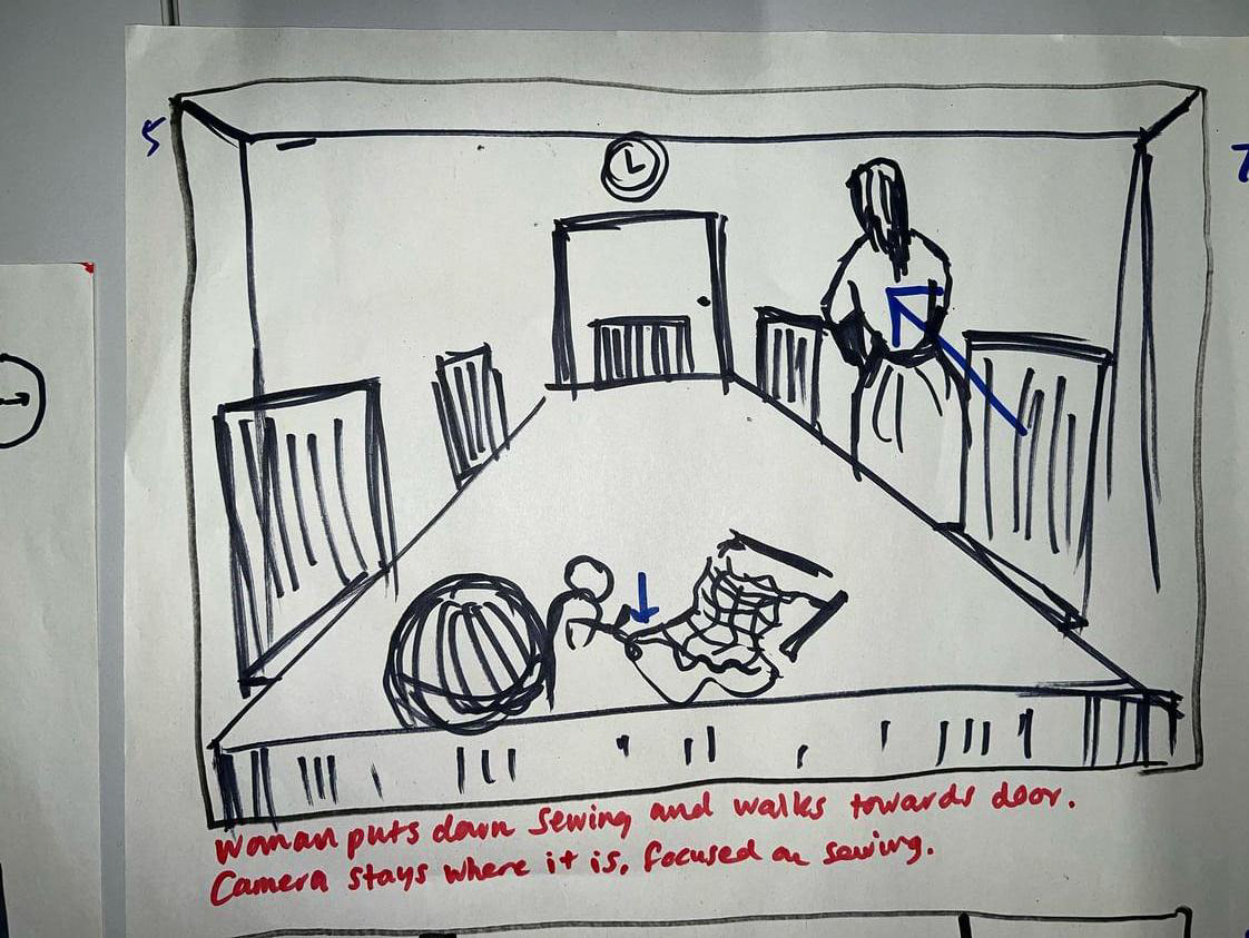
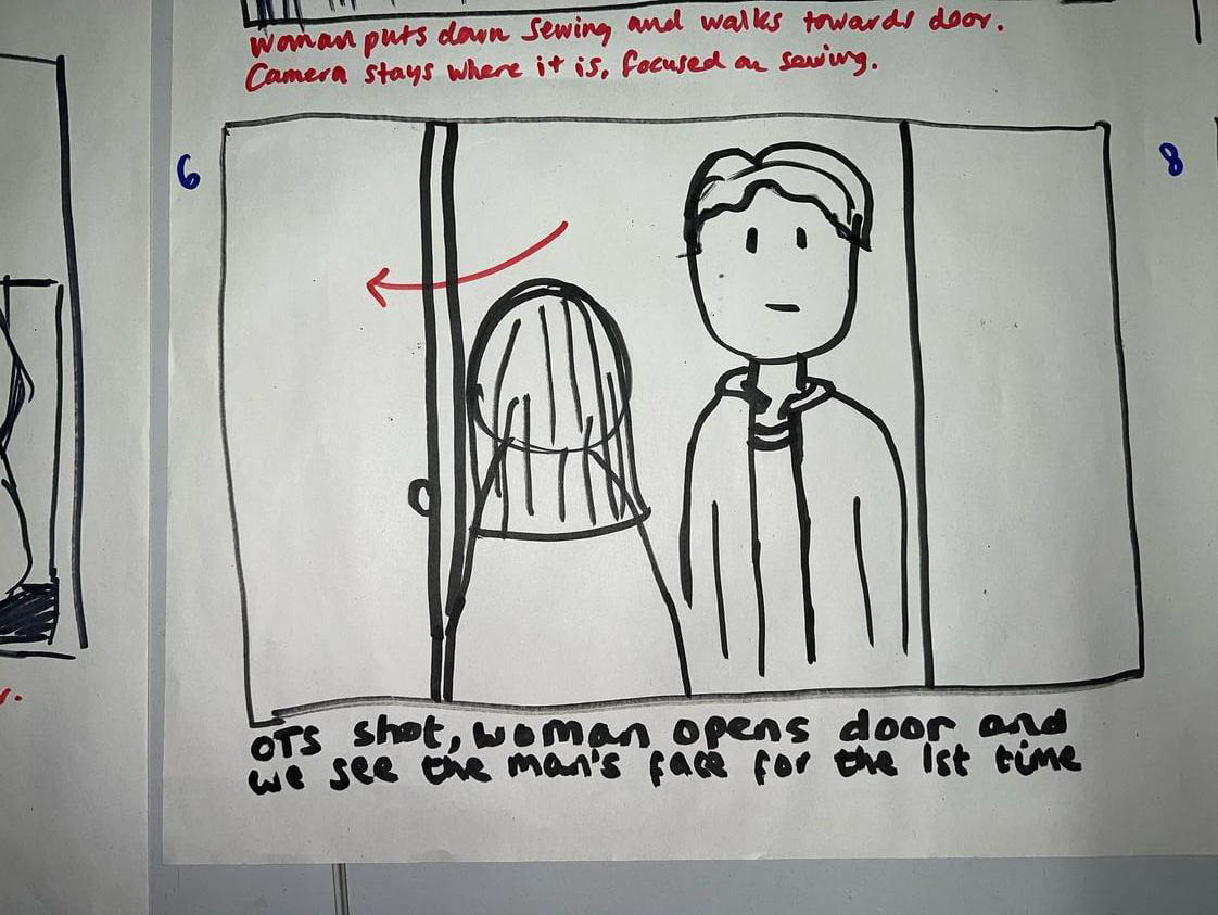
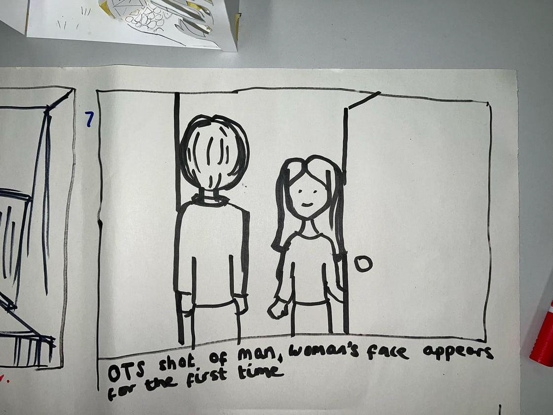
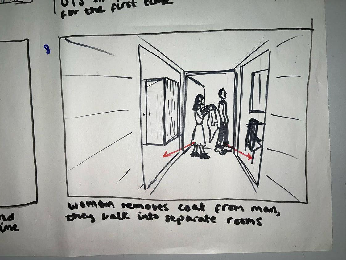
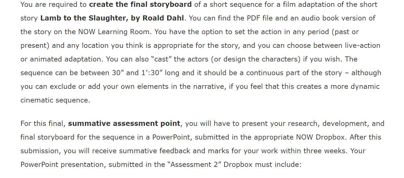
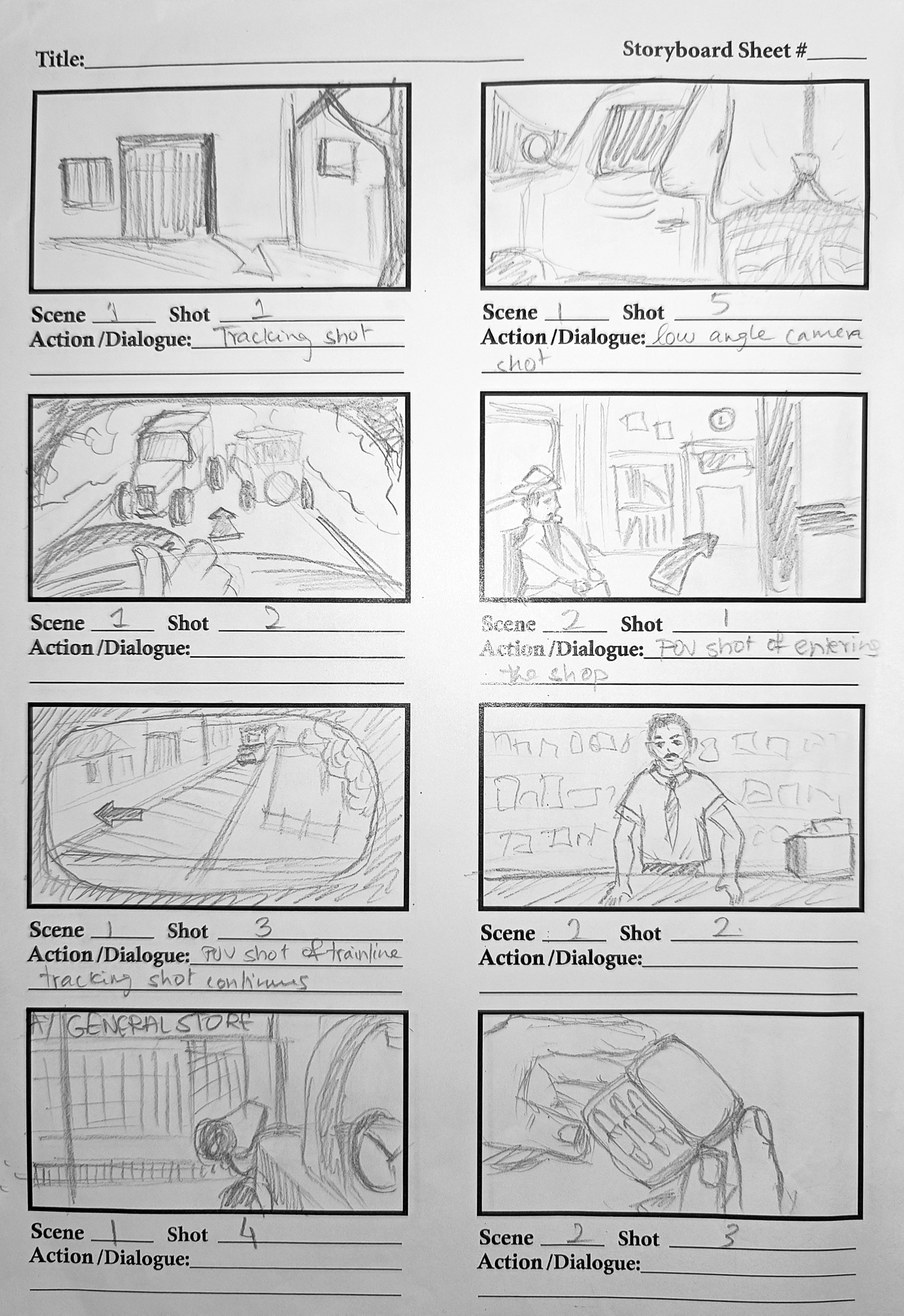
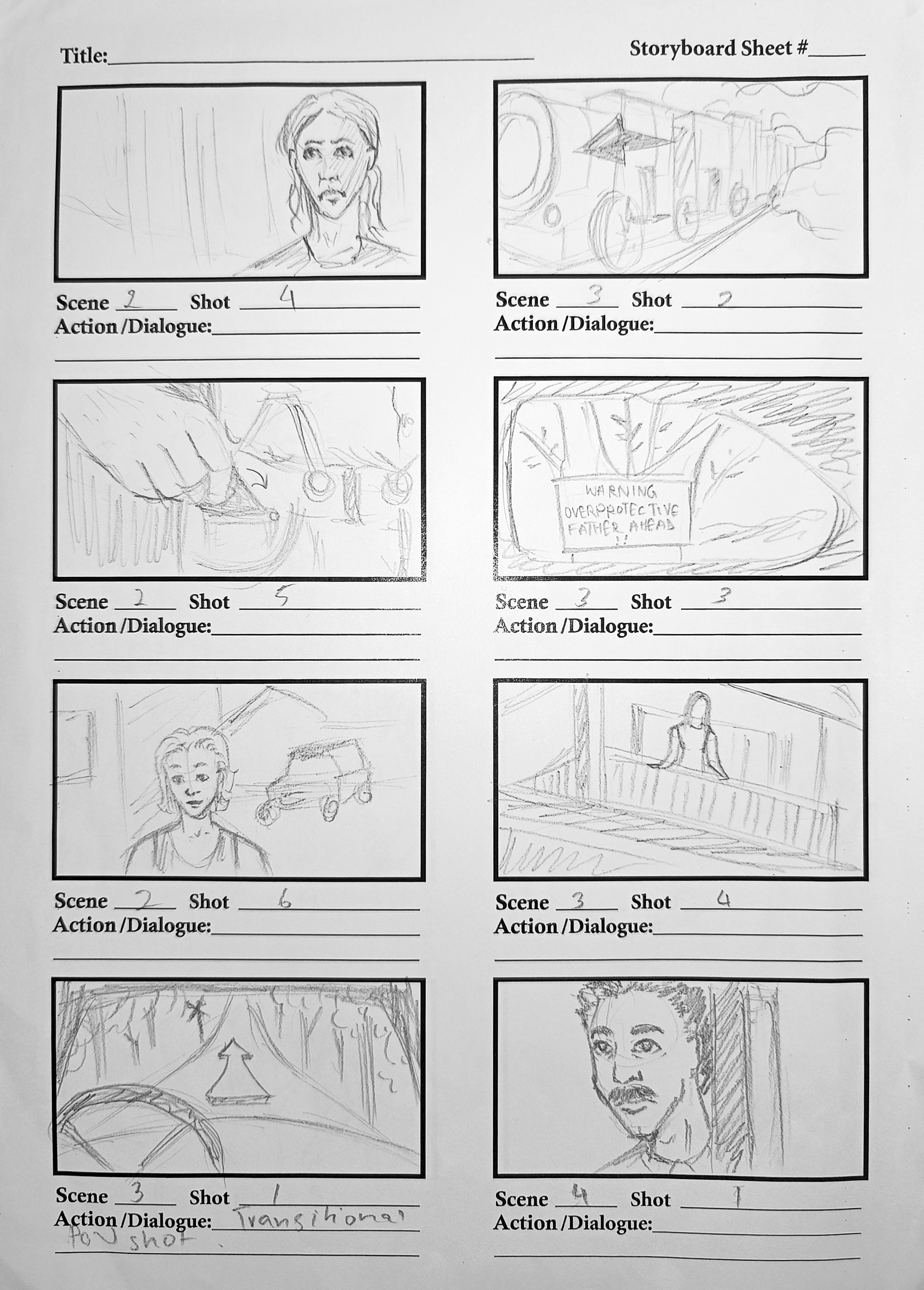
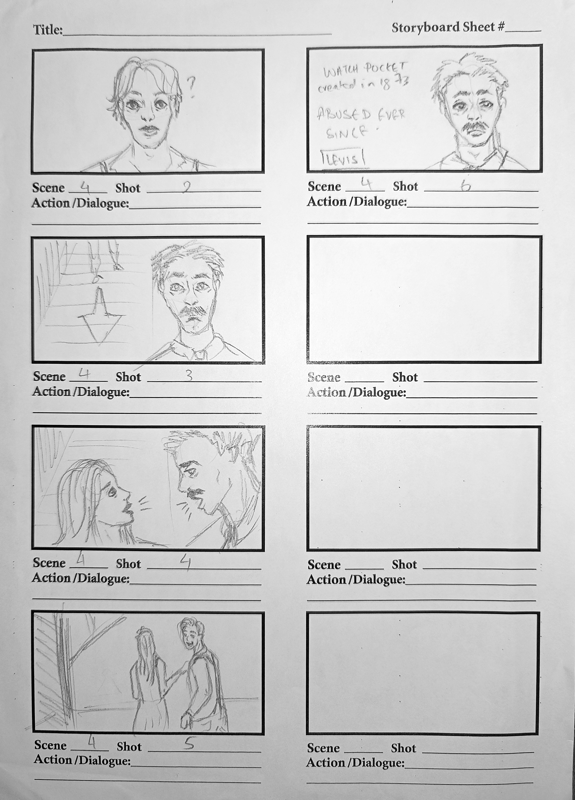
To familiarize ourselves with storytelling and typical storyboarding techniques, we were divided into groups of five and tasked with storyboarding the first two pages of a book on an A2 sheet. This proved to be quite beneficial, especially since I was paired with individuals from photography, costume design, and graphic design backgrounds. It quickly became apparent that despite all being art students, we each had a unique approach to storyboarding. We evenly distributed our tasks to ensure everyone had an opportunity to sketch out at least one frame from the scene.
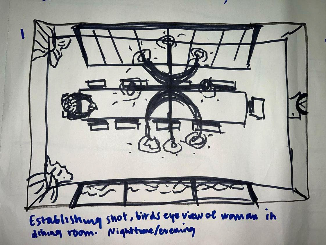
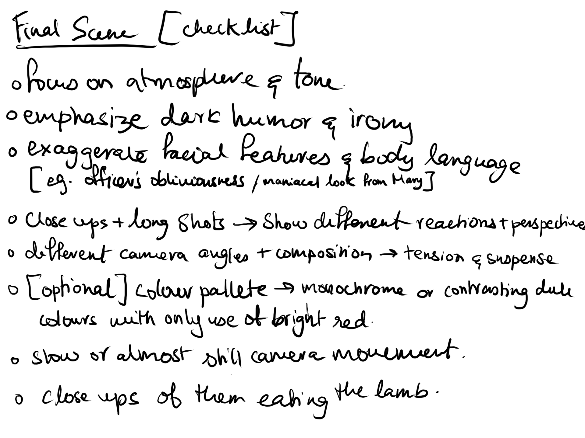
I've chosen to storyboard the final scene, highlighting Mary Maloney's meticulous plan to deflect suspicion. This decision underscores a subtle narrative approach, eschewing overt movement to focus on the calculated nature of Mary's actions. The goal is to encourage contemplation, enabling the audience to engage with the unfolding revelation on a deeper, more reflective level.
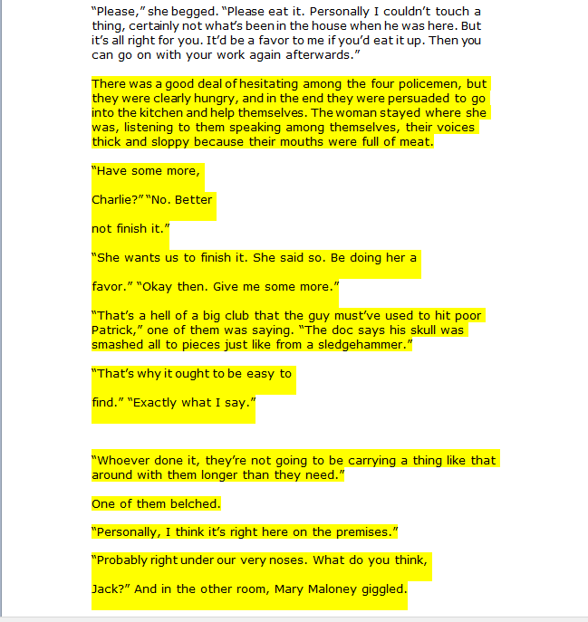
Time Period and Area chosen: UK, 1910's
1910'S
KITCHEN DECOR
KITCHEN DECOR
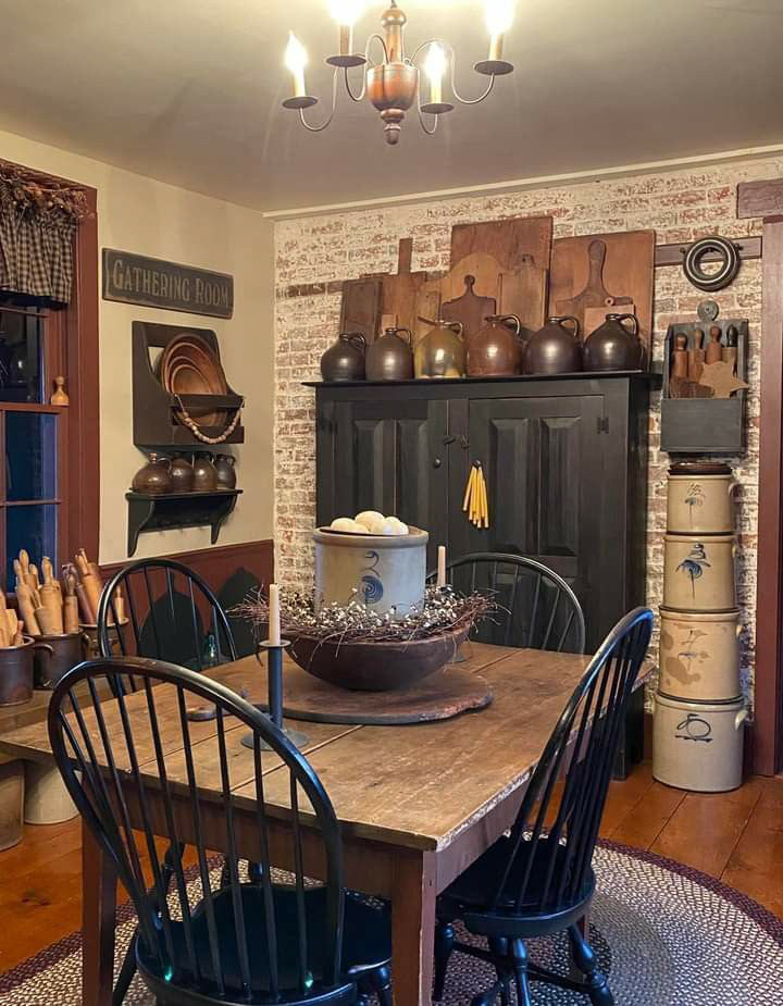
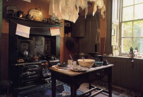
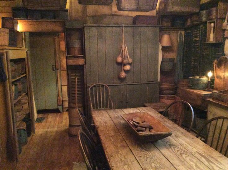
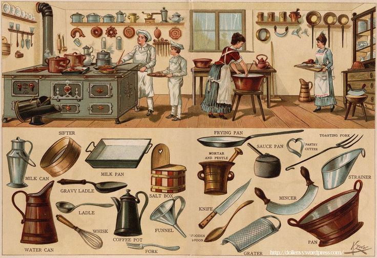
In the 1910s, home interiors had a refined and elegant style. Furniture was big and detailed, often made of dark woods like mahogany. Earthy colors like green and red were popular, and heavy fabrics like velvet and damask were used for upholstery. Wallpaper with floral patterns decorated walls and ceilings. Chandeliers were common, and electric lighting was becoming more popular. Decorative items like mirrors, clocks, and vases adorned rooms.
Other objects to add in the scene
Map Key
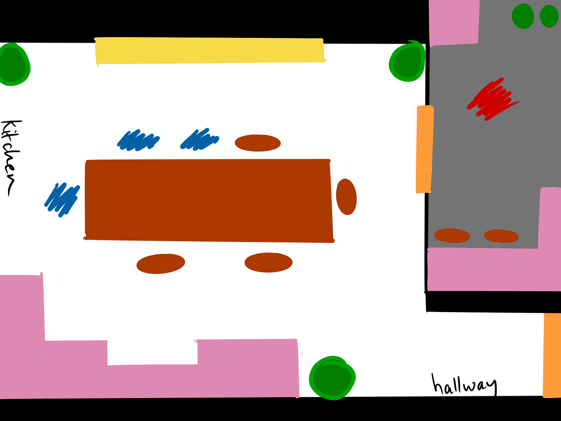
Main setting map
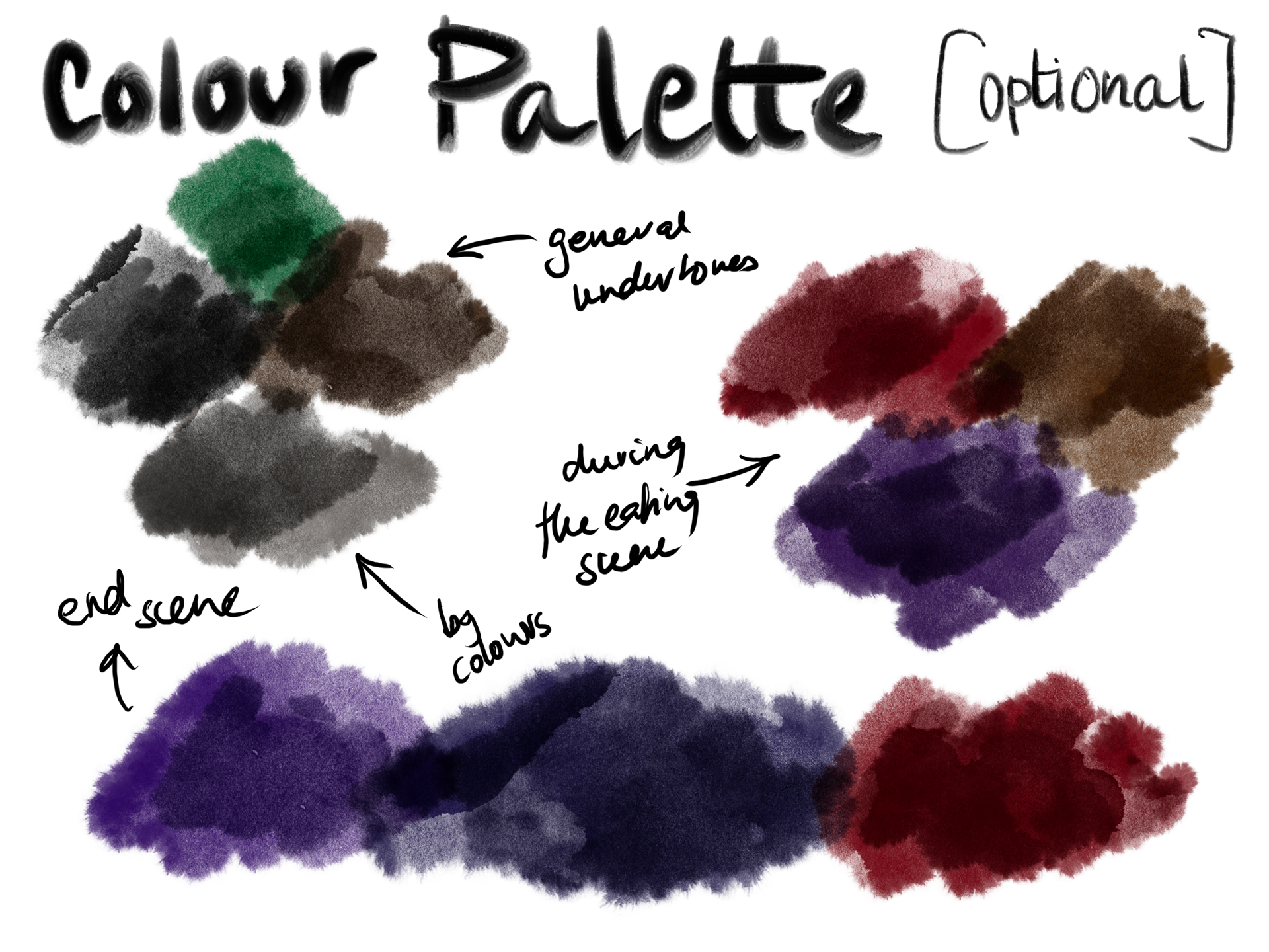
Main setting colour palette (optional)
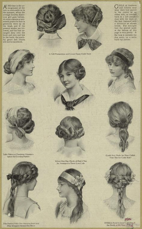
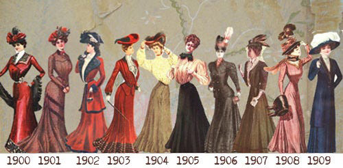
1910'S
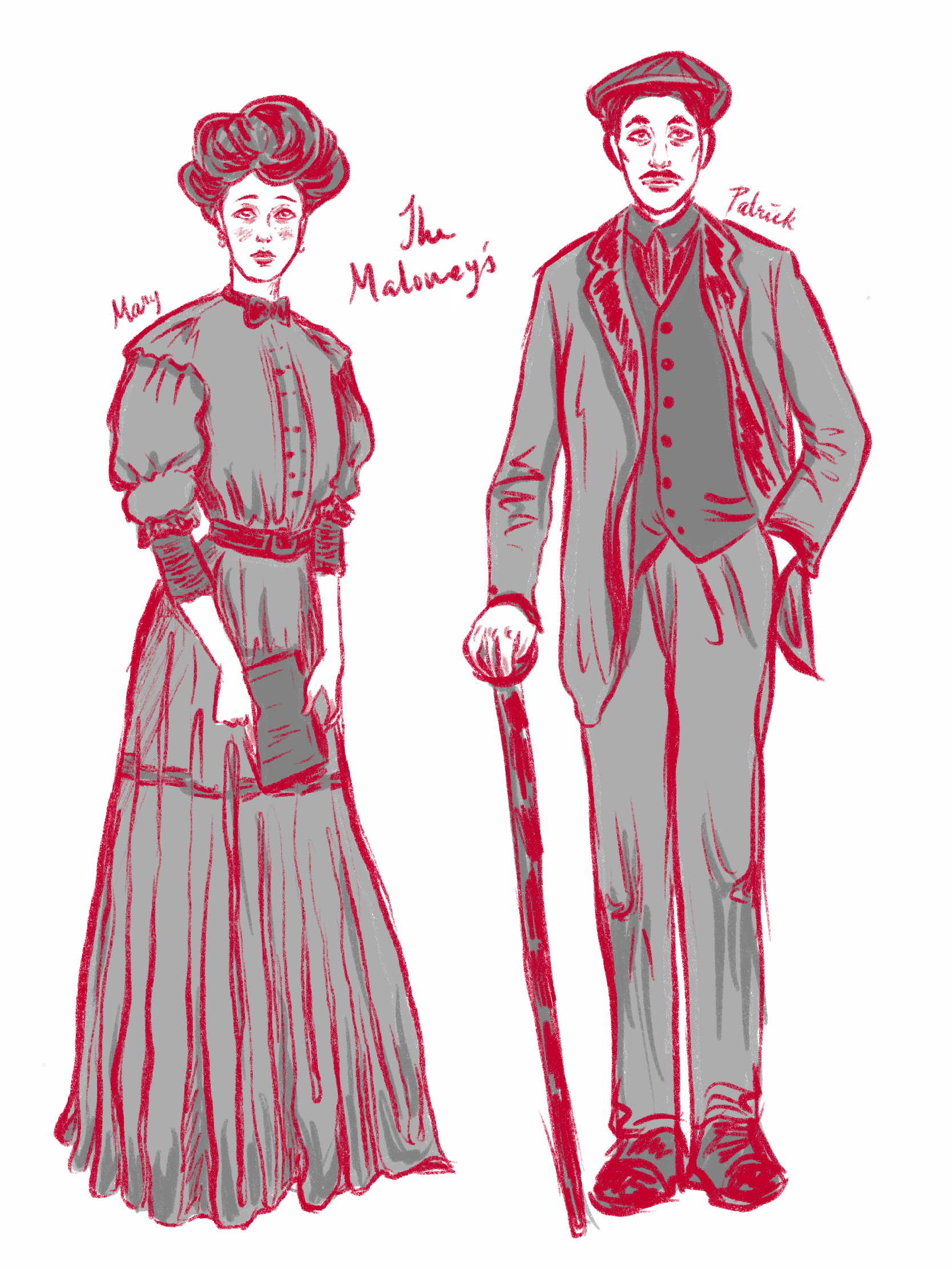
WOMEN'S FASHION
WOMEN'S FASHION
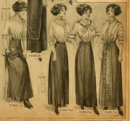
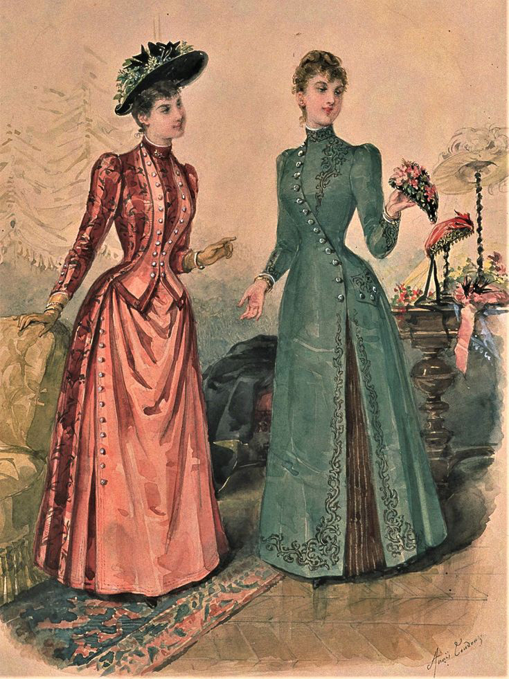
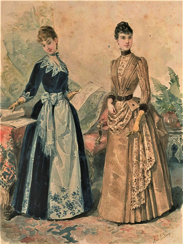
Women typically wore dresses with long sleeves, high necklines, and layered skirts. The fabrics were typically cotton, wool, or silk, and the dresses were often in dark and muted colors like navy, grey, or brown.
In this scene, Mary could be dressed in a modest and unfashionable dress, perhaps with long sleeves and a high neckline. The dress could be black or navy, in a plain and somber style. The dress should be simple and not flashy, with minimal decoration as 'respect' towards her late husband and also to reflect her class
In this scene, Mary could be dressed in a modest and unfashionable dress, perhaps with long sleeves and a high neckline. The dress could be black or navy, in a plain and somber style. The dress should be simple and not flashy, with minimal decoration as 'respect' towards her late husband and also to reflect her class
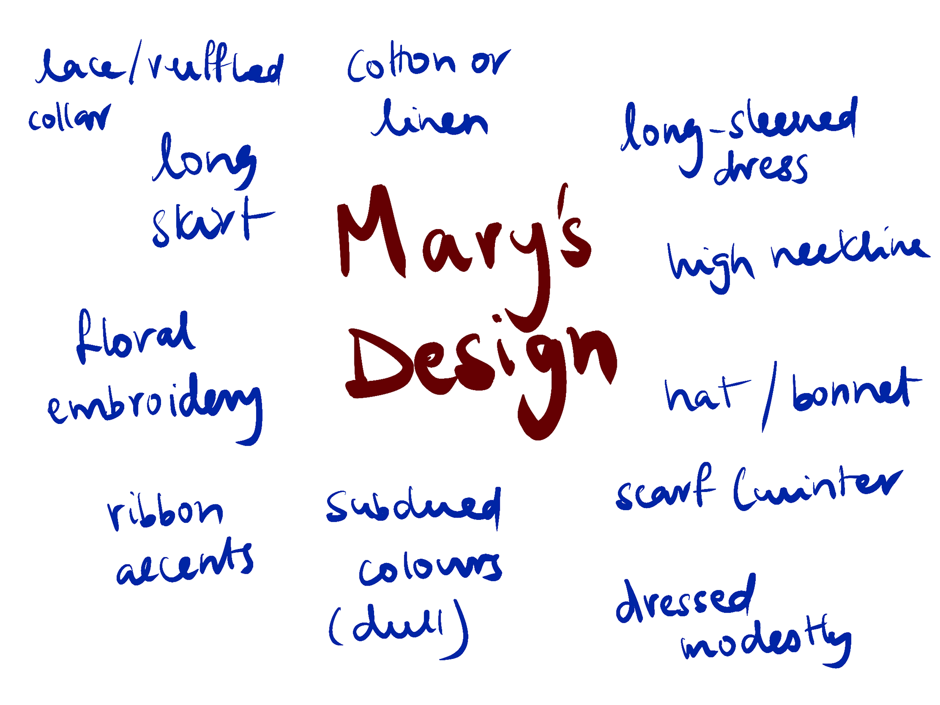
Other details to add onto Mary's design
Character Design
1910'S
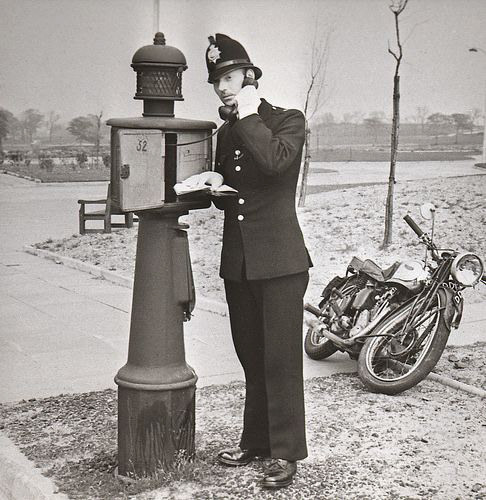
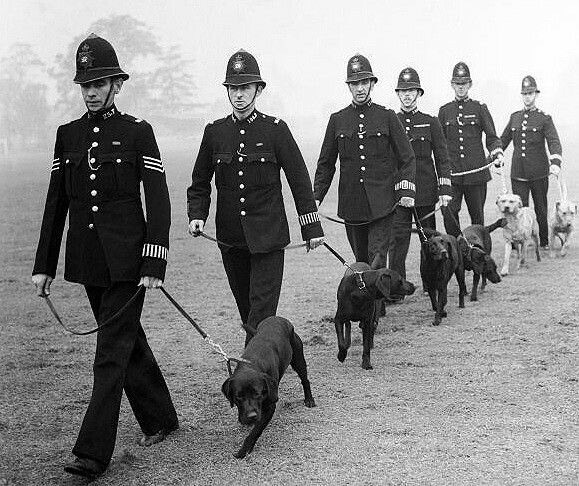
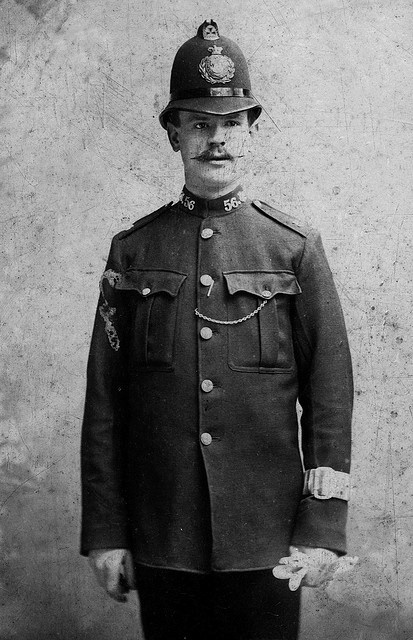
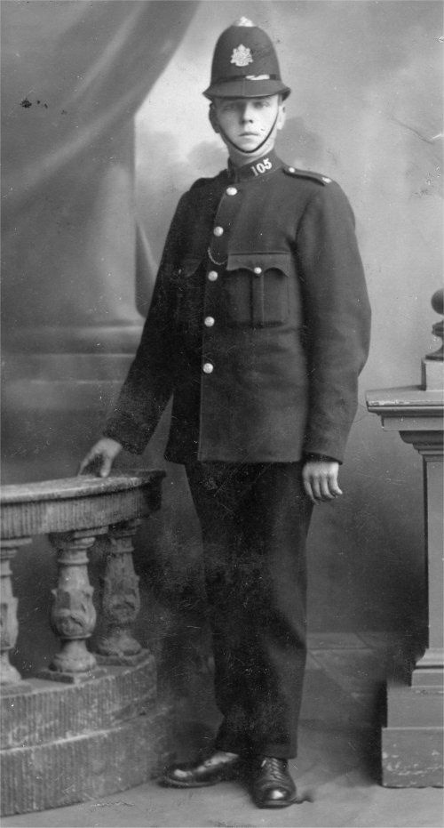
POLICEMEN
POLICEMEN
In the 1910s, policemen wore a uniform that was inspired by the British police officers. Their dress uniform typically comprised of a dark blue or grey uniform, with a stiff collar and dark top cap. The uniform would be smart and serious looking, with a sense of authority and discipline. The bands on their arm indicated their rank and position.
Character Design
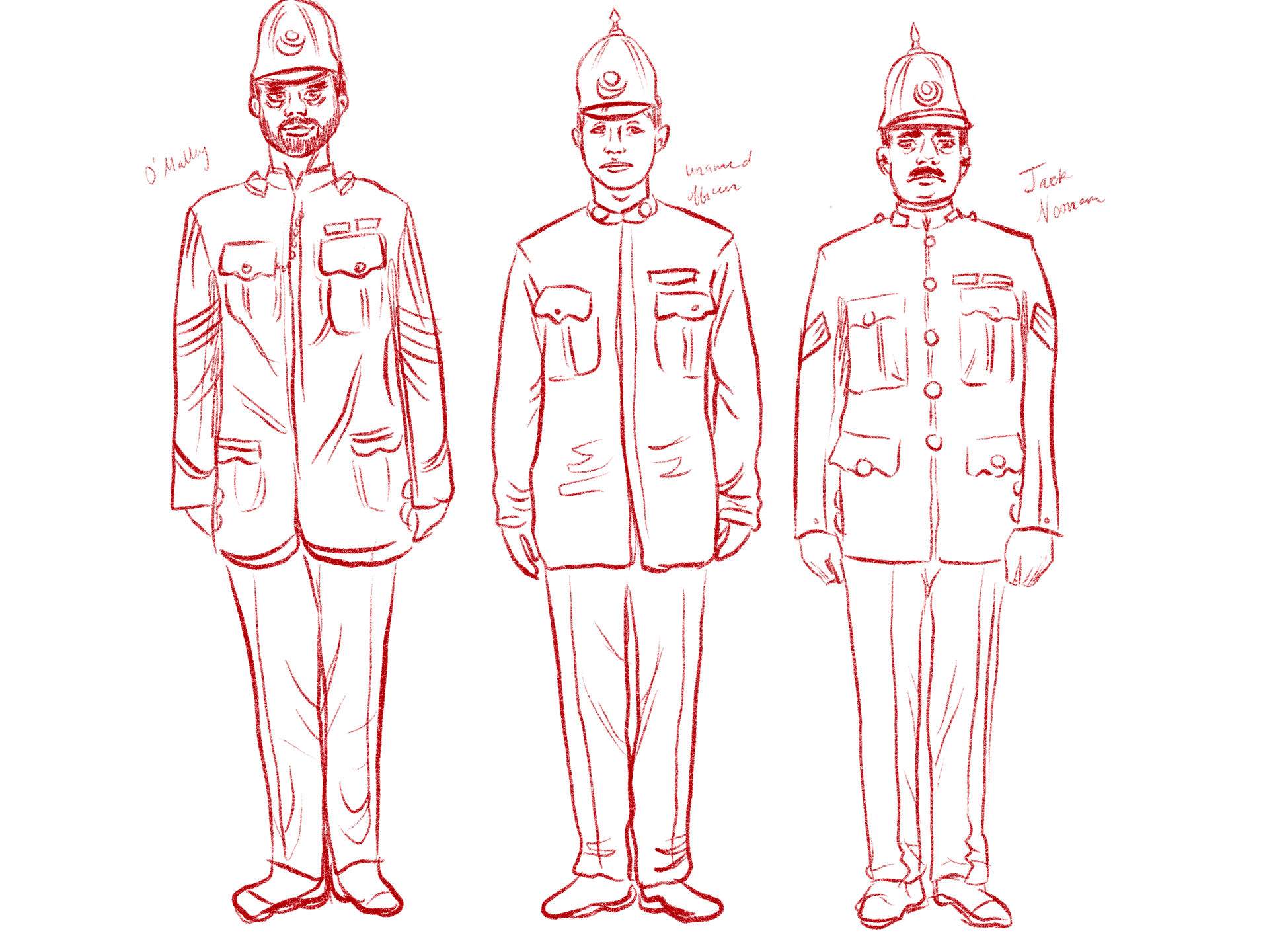
The three policemen (minor characters)
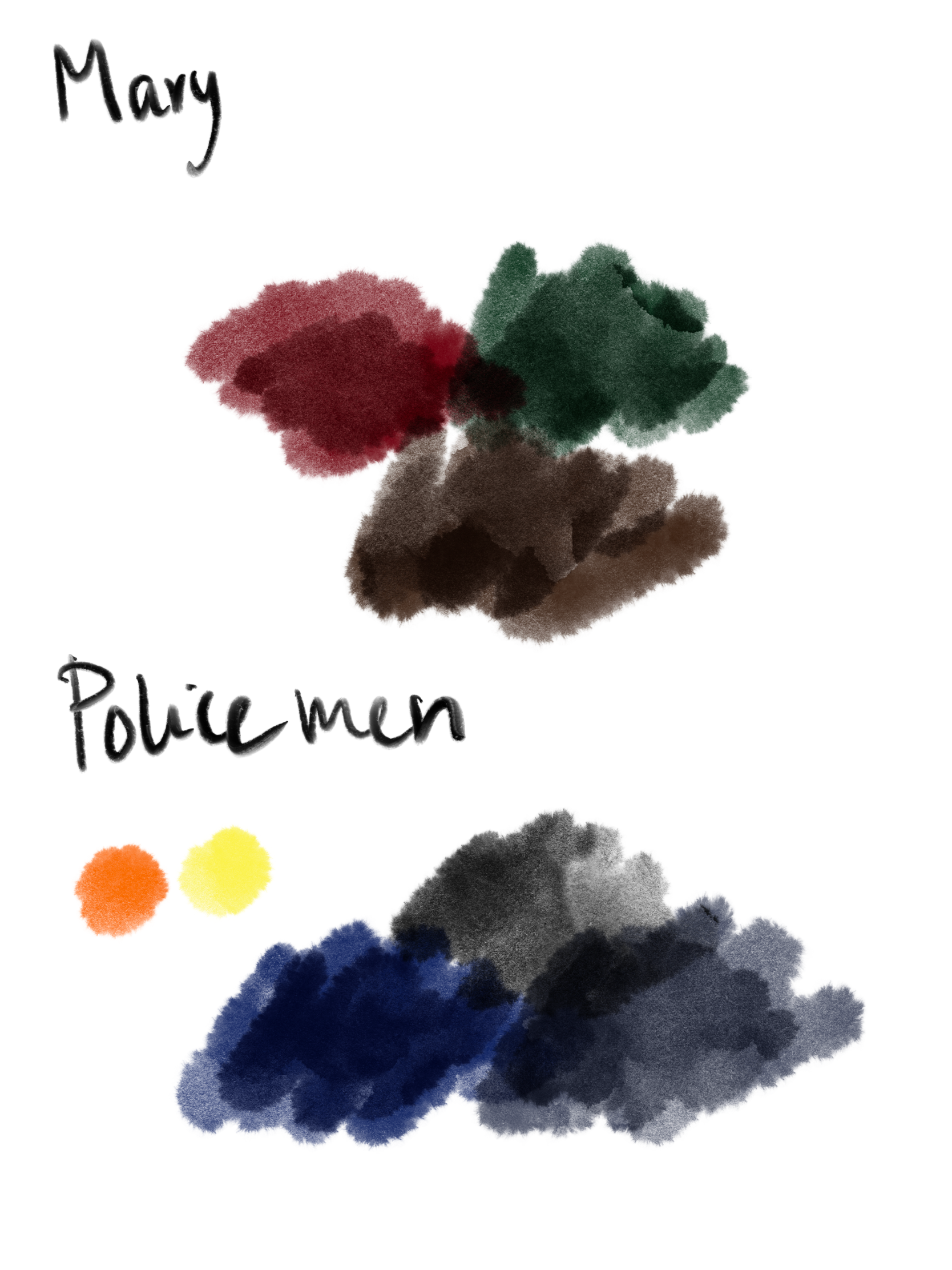
Mary and the policemen's colour palette (optional)
Going About The Scene
Here are some additional notes:
The visual elements I am featuring are a carefully curated color palette of rich, deep hues like burgundy, navy blue and forest green. Strategic camera angles and compositions will provide cinematic storytelling, emphasizing character emotions and key narrative elements. Distinctive character designs will capture the essence of the Edwardian era, while selected props and details will enrich the narrative with historical authenticity. In summary, each visual element serves a purpose in enhancing the thematic resonance of the storytelling.
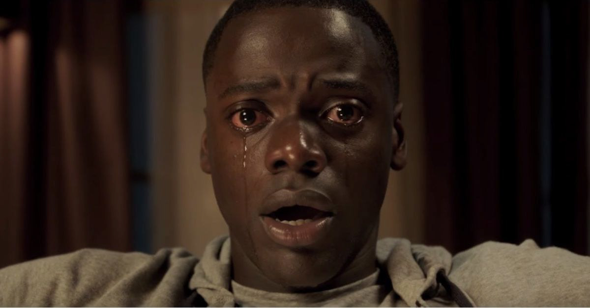
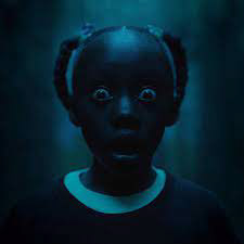
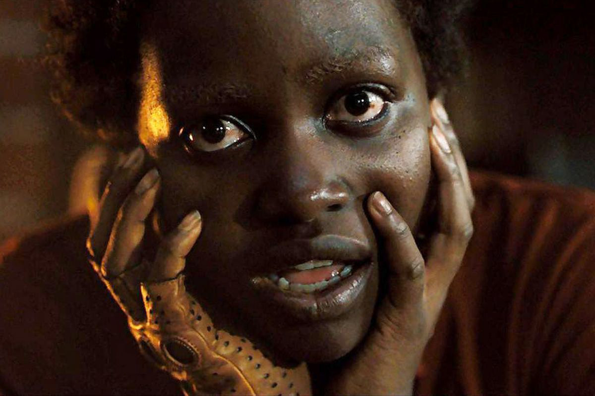
Director Inspiration- Jordan Peele
(Close up shots, Staging and Blocking)
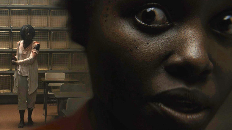
Jordan Peele's skillful use of close-up shots, staging, and blocking is a hallmark of his directorial style, contributing to the immersive and impactful storytelling in his films.
In Peele's work, close-up shots are strategically employed to capture the subtle nuances of characters' expressions and reactions, intensifying emotion and suspense. By bringing the audience closer to the characters, Peele creates a sense of intimacy that enhances audience engagement and empathy. These close-up shots often reveal crucial details and foreshadow events, enriching the narrative experience.
Additionally, Peele's staging and blocking techniques play a pivotal role in shaping the visual composition of his scenes. He meticulously arranges actors within the frame to convey power dynamics, tension, and symbolism. Through careful positioning and movement, Peele creates dynamic and visually striking sequences that captivate viewers and reinforce thematic elements.
Furthermore, Peele's use of blocking, which refers to the movement and positioning of actors within a scene, is instrumental in conveying character relationships and motivations. By choreographing movements with precision, Peele heightens dramatic tension and emphasizes key moments, ensuring that each scene resonates with narrative impact.
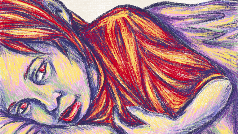
Art Style Inspiration- Junji Ito
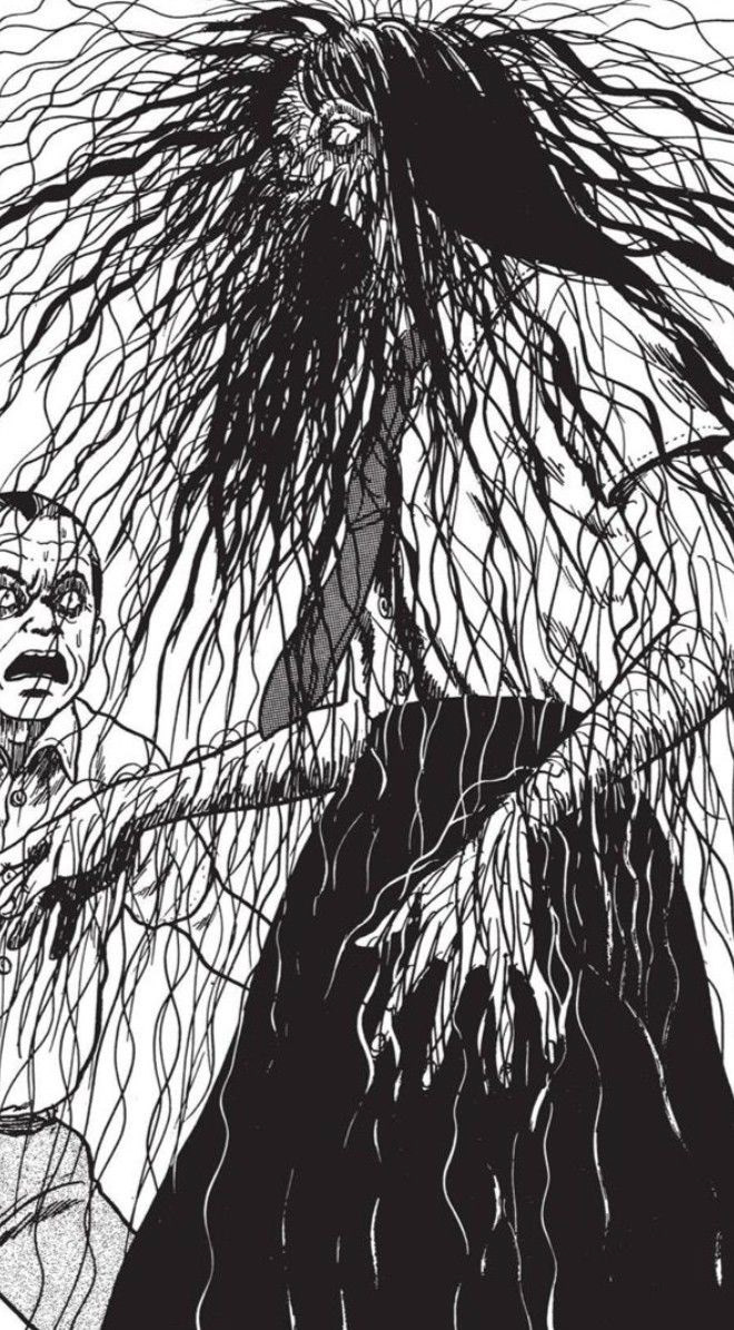
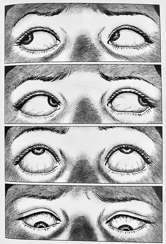
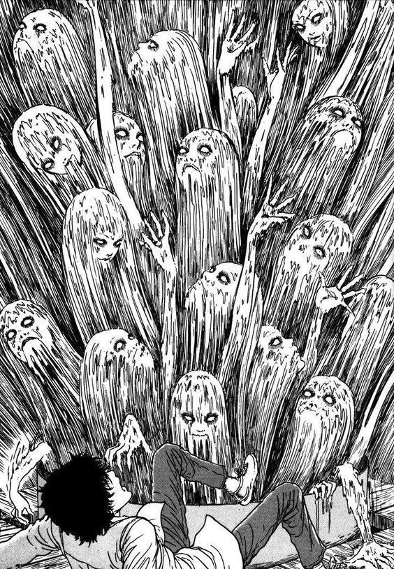
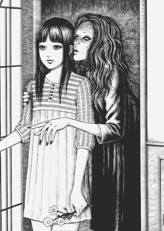
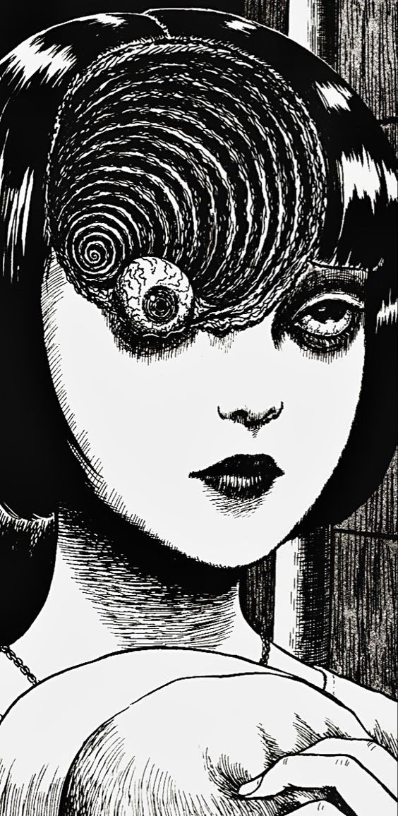
Junji Ito's art style is renowned for its intricate detail, macabre imagery, and ability to evoke a sense of unease. Characterized by elaborate linework, hauntingly realistic designs, and grotesque imagery, his work pushes the boundaries of horror manga. Through meticulous craftsmanship and attention to atmosphere, Ito creates immersive and foreboding environments that serve as the perfect backdrop for his chilling narratives.
In addition to his technical skill, Ito's art style is known by its penchant for grotesque and unsettling imagery. He has a knack for portraying the grotesque and horrific in a way that is both terrifying and captivating, often pushing the boundaries of the medium with his nightmarish creations. From grotesque monsters to grotesque transformations, Ito's artwork is filled with visceral and unsettling imagery that leaves a lasting impression on readers.
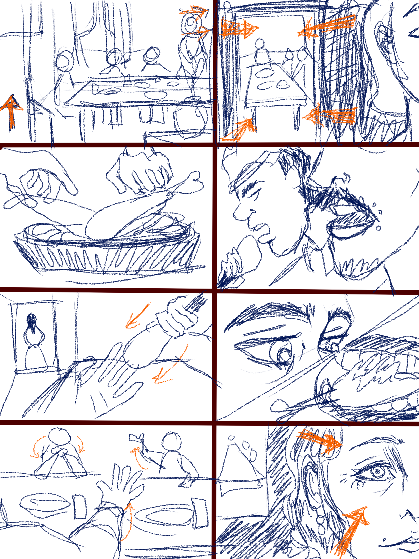
Rough Storyboards
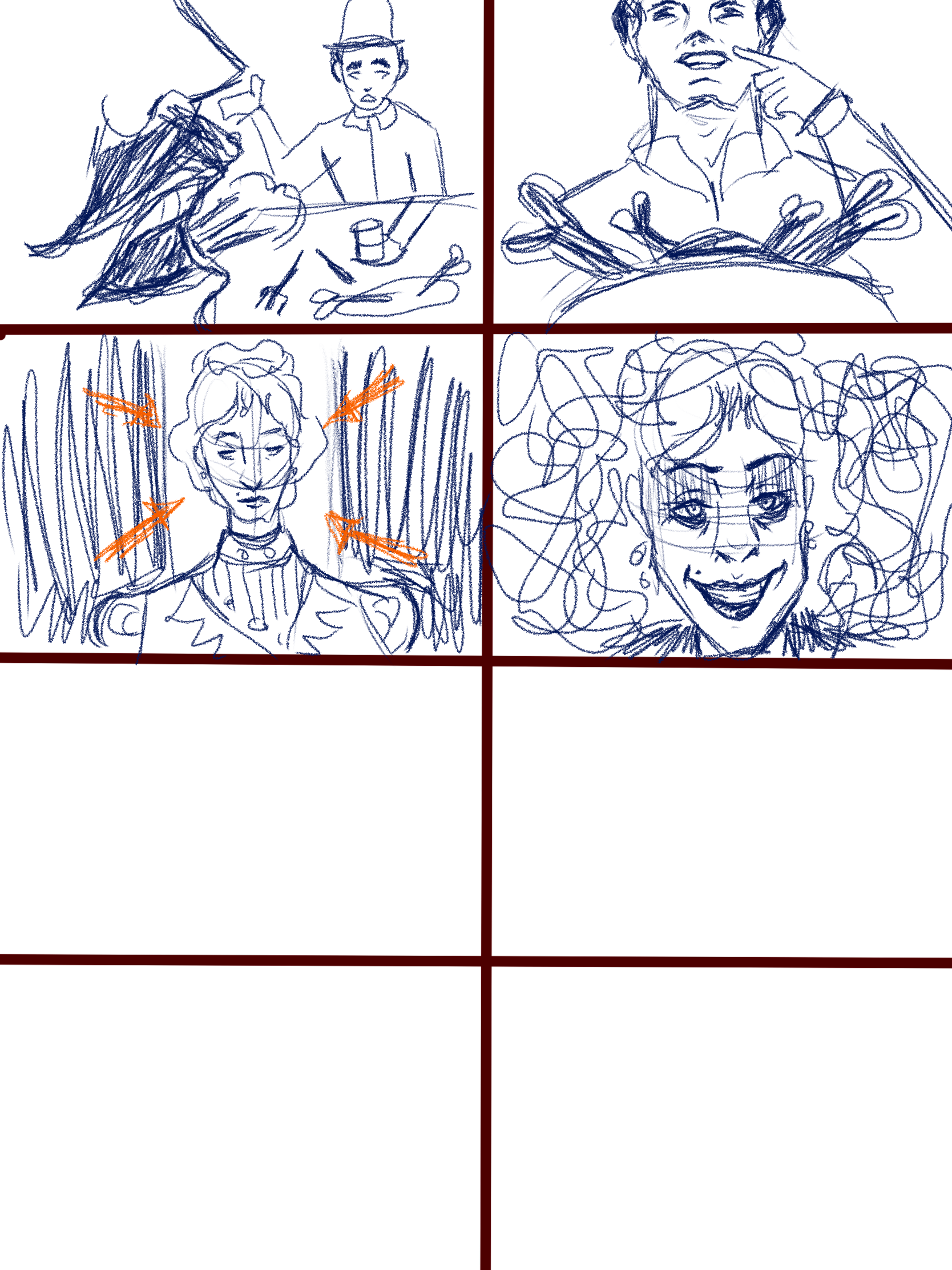
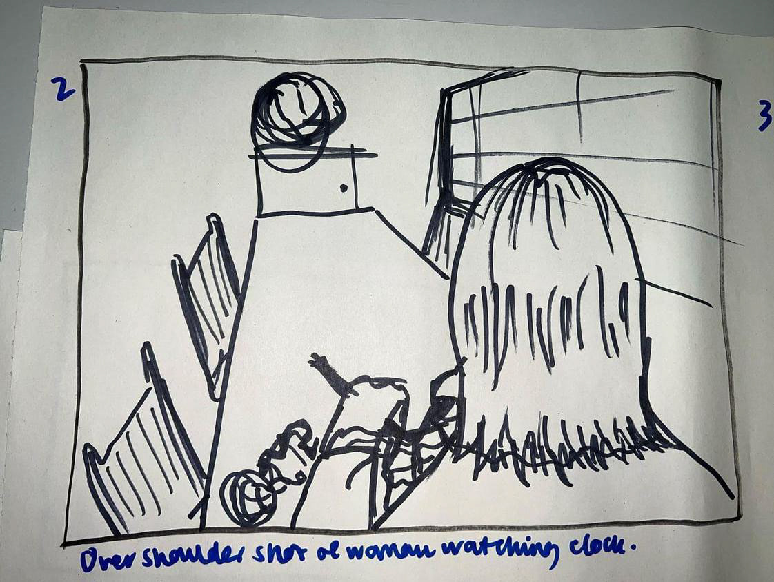
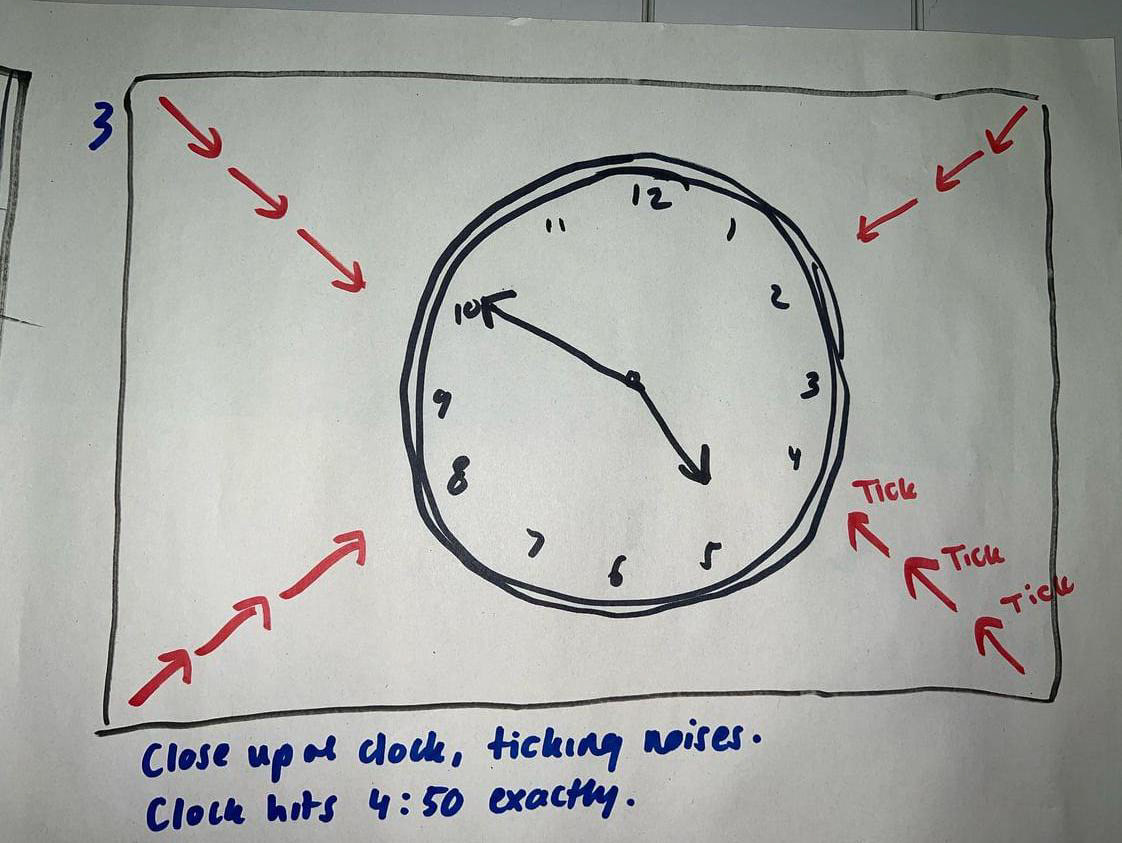
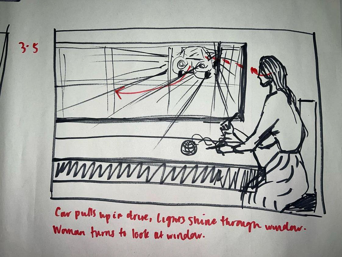
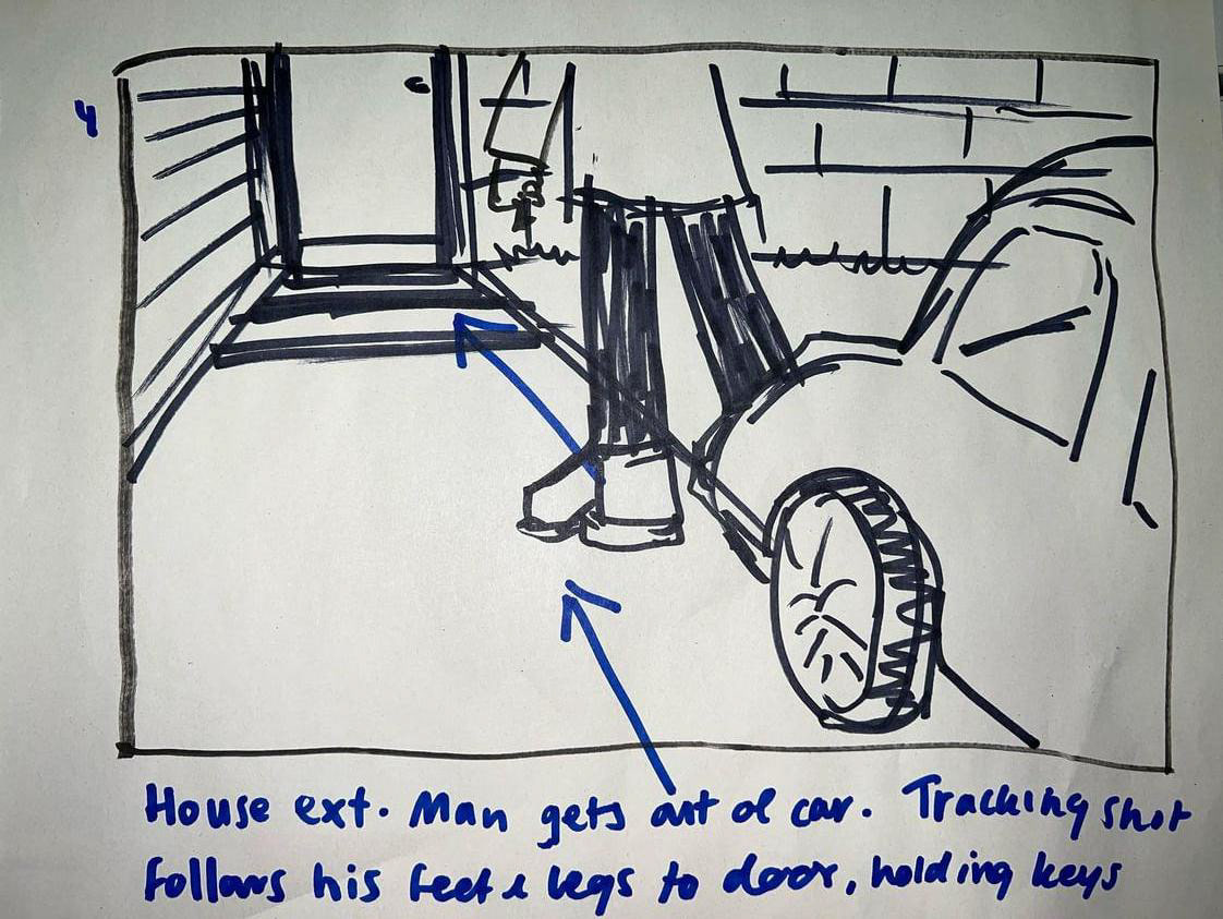
Final Storyboards


Some final notes and direction:
In illustrating the scene, my overarching thematic objective is to evoke an eerie and uncomfortable ambience, drawing inspiration from Jordan Peele's directorial style. I deliberately opted for a screen ratio of 5:7 to impart a sense of constriction and close proximity within the room. The intent is to deliberately obscure the faces of the policemen, utilizing extreme close-ups to convey an impression of corruption and rudeness, rather than projecting them as respectful, authoritative figures. To achieve this portrayal, the focus remains on depicting them diving into the leg of lamb with hungry gazes, deliberately avoiding a humanizing perspective.
The decision to fully reveal only Mary's face, and that too at the conclusion, serves to emphasize her distinctiveness within the narrative. The sole sources of illumination within the scene are a dimly lit ceiling light and a fireplace, contributing to an overall subdued visual atmosphere. As for the soundtrack, my envisaged approach involves incorporating the constant crackling of a fireplace, interwoven with the dialogue exchanged at the table, accompanied by disconcerting sounds of chewing, licking, and laughter. Notably, Mary maintains complete silence until the final shot, where her laughter punctuates the scene.
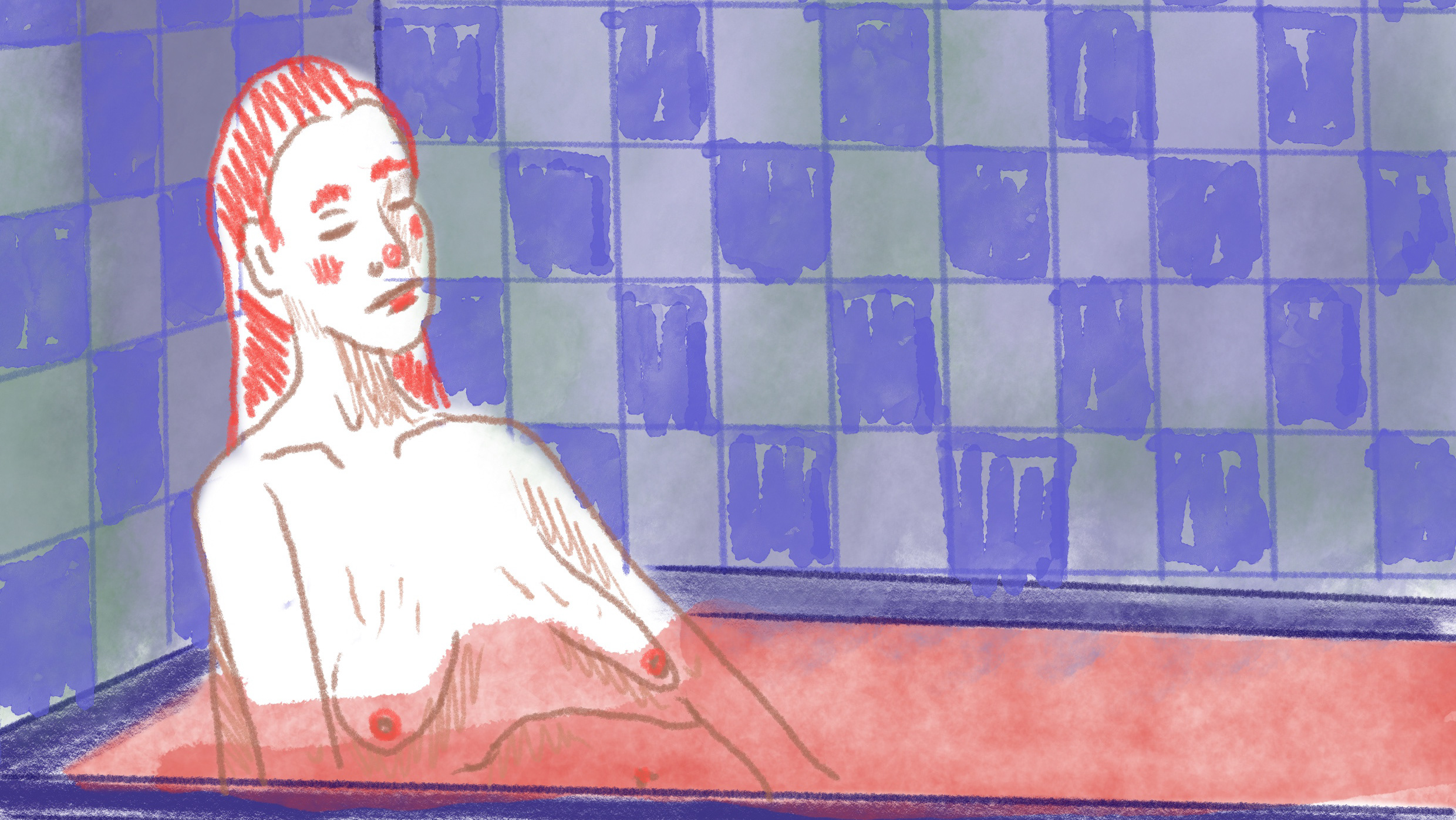
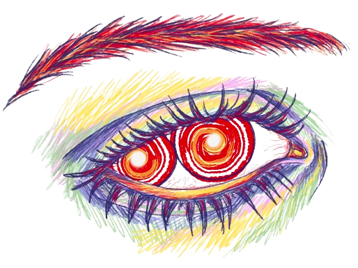
Regarding the color scheme, I have elected to maintain a greyscale palette throughout, with the exception of the colour red. The utilization of red specifically on the leg of lamb is intended to direct the audience's attention to the ironic nature of the scene. Additionally, towards the conclusion, red is selectively applied to Mary's eyes. This deliberate choice serves a dual purpose: to underscore her connection to the overarching irony and the act of murder within the narrative and to visually depict her descent into madness.