The Brief
Our task was to design one or two double-page spreads on the theme of playgrounds. We could approach this as a game, activity, or story. Considering the audience for Anorak is toddlers to preteens, incorporating bright colors, strong line work, and engaging characters would greatly enhance the project.
Initial Ideas
I knew I wanted to explore either a game or activity since I had already delved into multiple storyboards, zines, and other forms of storytelling throughout the year. The concept of creating a game or activity was relatively new to me and presented a challenge. To get started, I examined pages from different kids' magazines and storybooks. The style in these publications differed significantly from my usual approach. I'm not accustomed to working with bold line work, opaque colors, or simply drawn characters. I tend to overcomplicate my work with excessive shading or details. Considering I was already stepping out of my comfort zone, I decided to stick with digital art to make the process less daunting for myself.


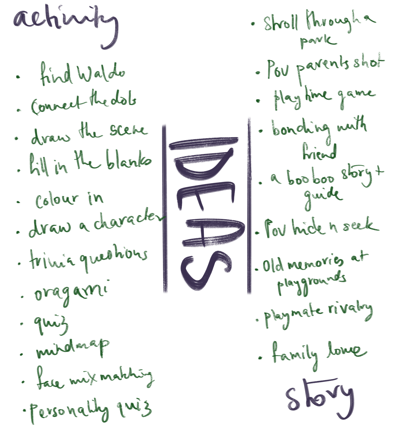
Here are my notes jotting down keywords to guide me through the theme of playgrounds. I also listed some activities I observed in most children's books. Alongside that, I opted to keep my options open and brainstormed some potential narratives in case the activity ideas didn't pan out.

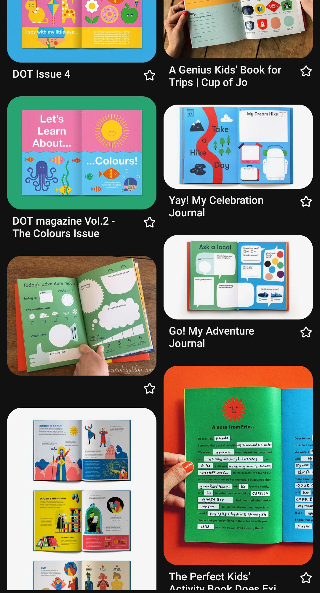
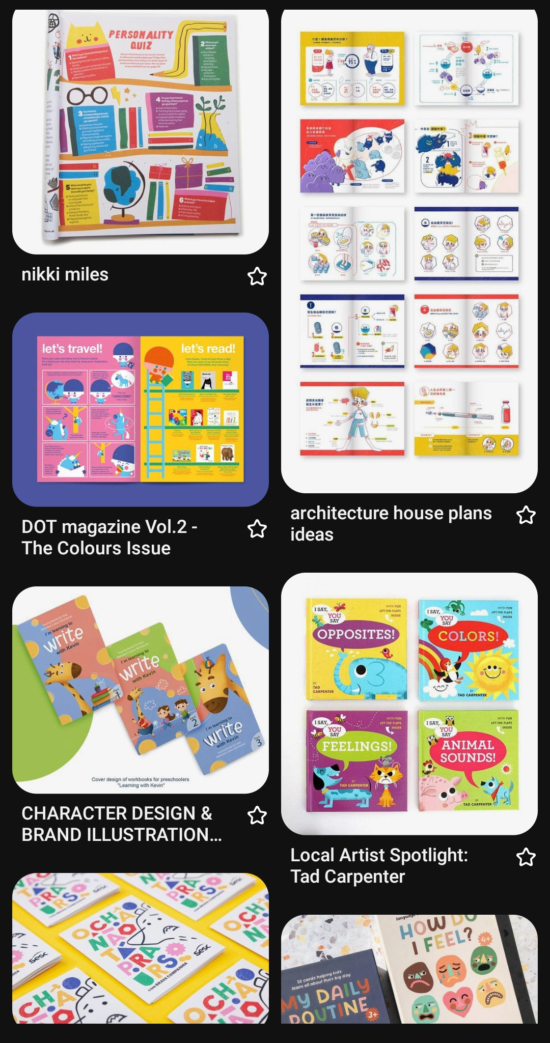
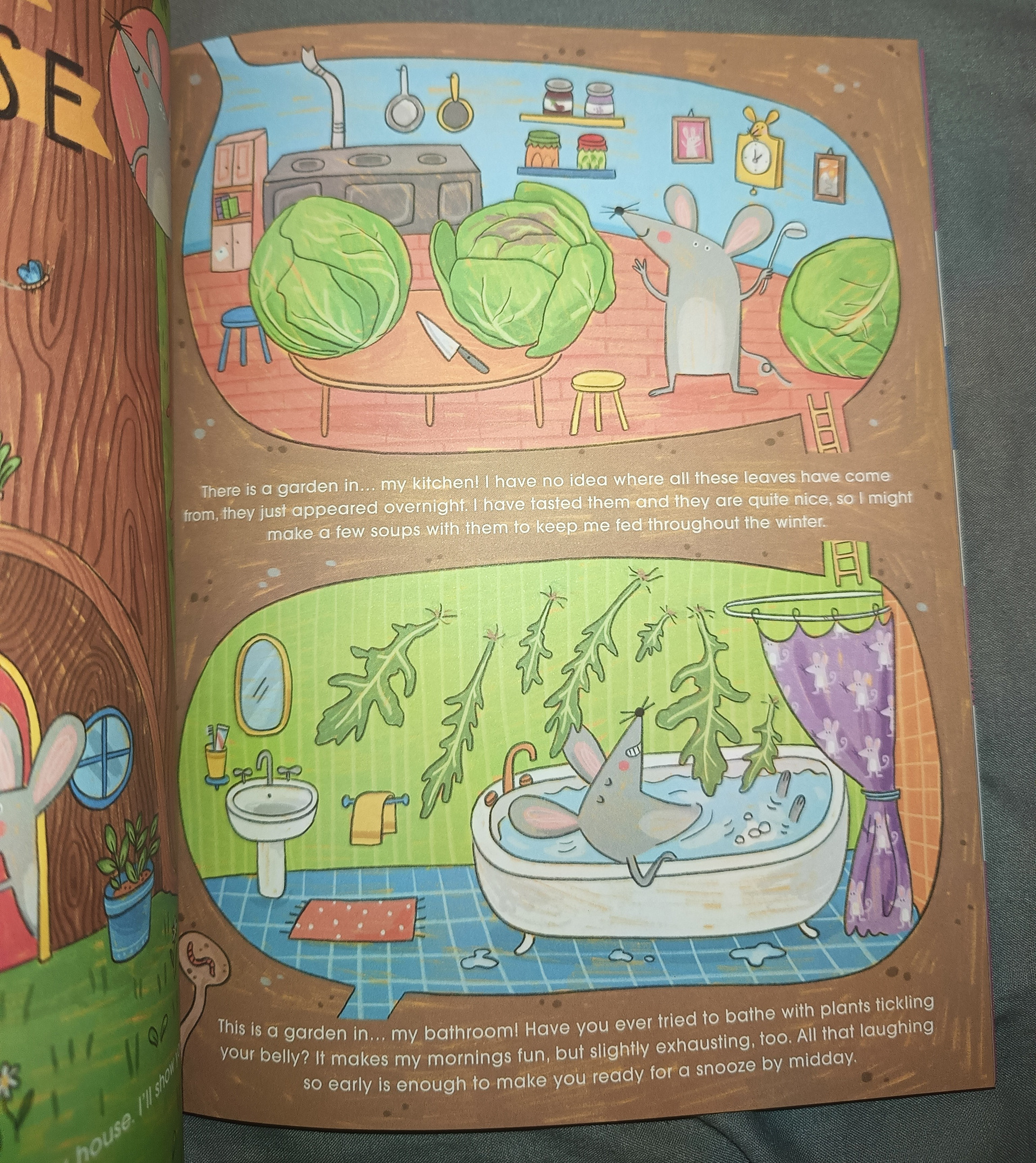
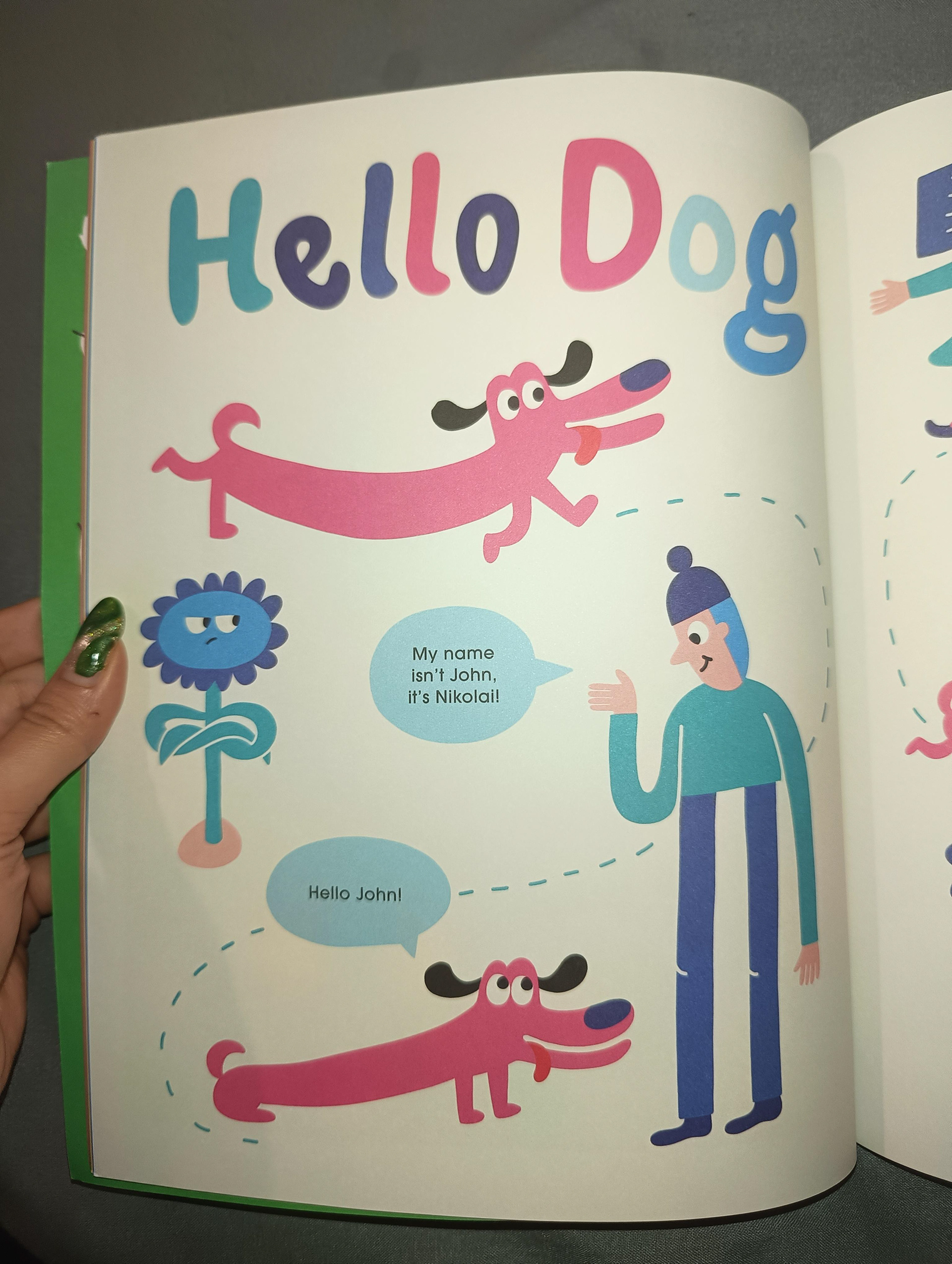
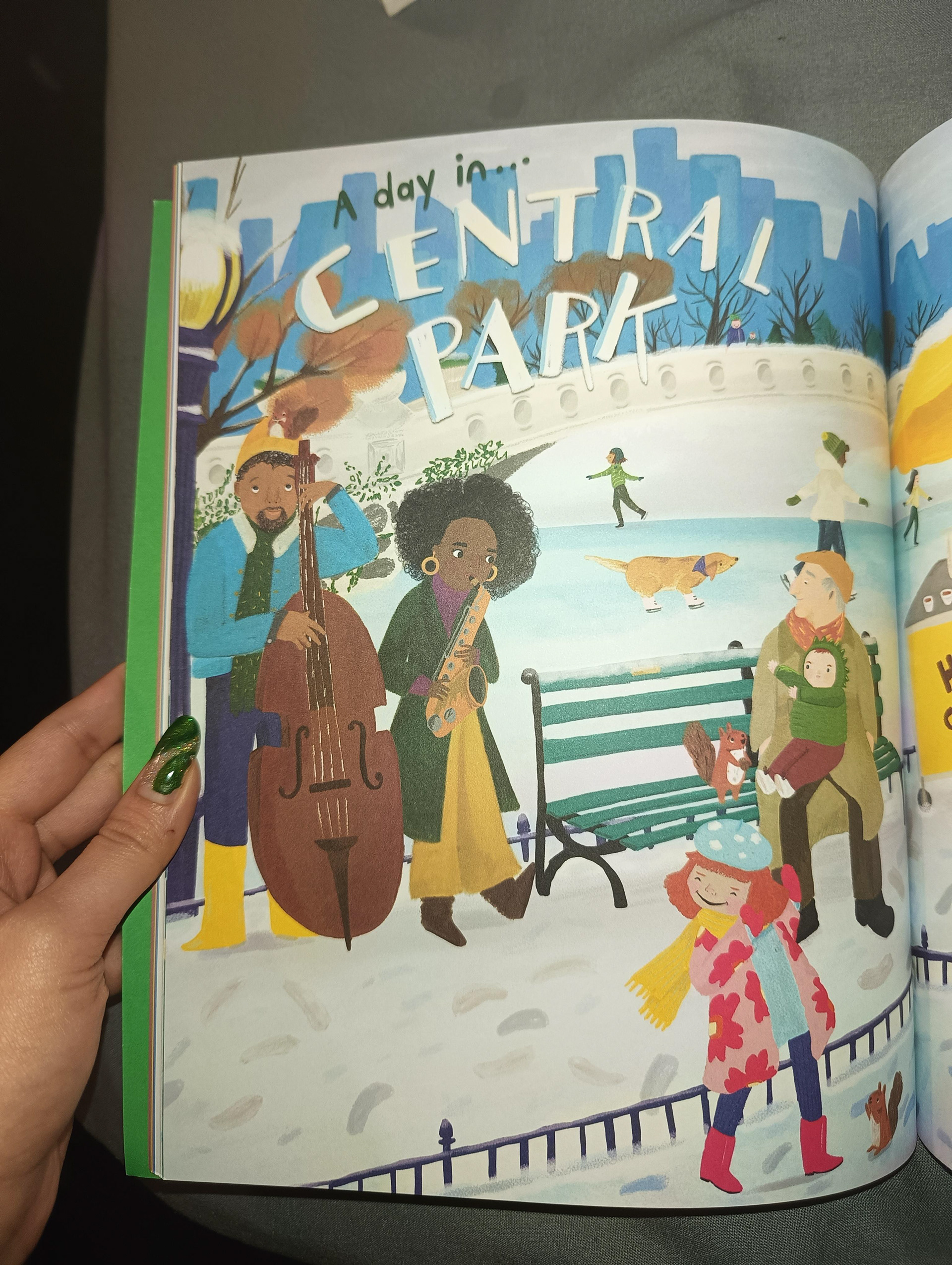
Favourite Anorak Pages
I was trying to get a feel for Anorak as a company. Thankfully, we were given two Anorak books and a Dot book, which made things easier.


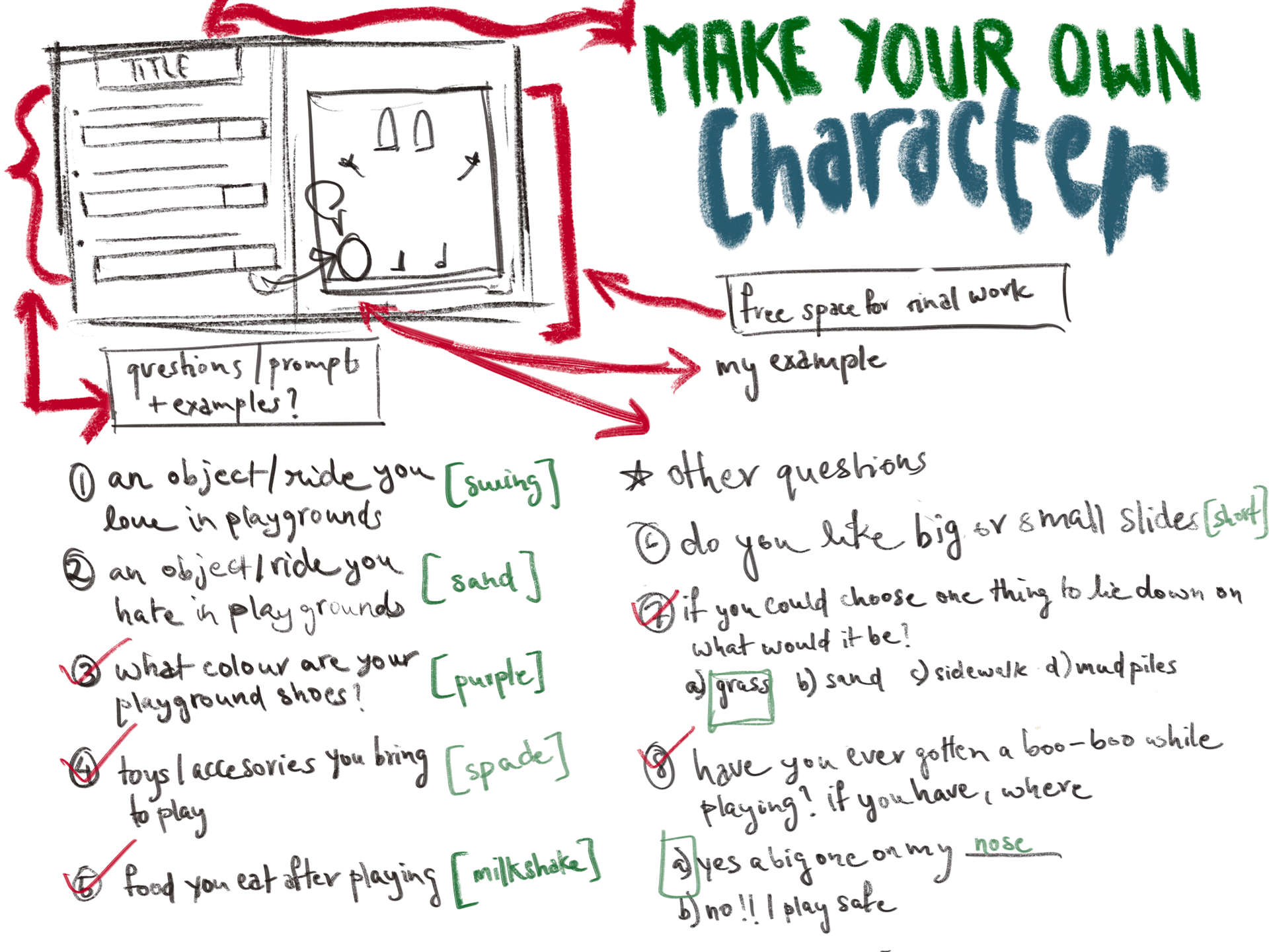
Make Your Own Character Idea
I chose to experiment with a popular activity I had taught in a class back home. It essentially involved character design prompts centered around playgrounds. Additionally, I wanted to incorporate another idea where participants would complete the story.
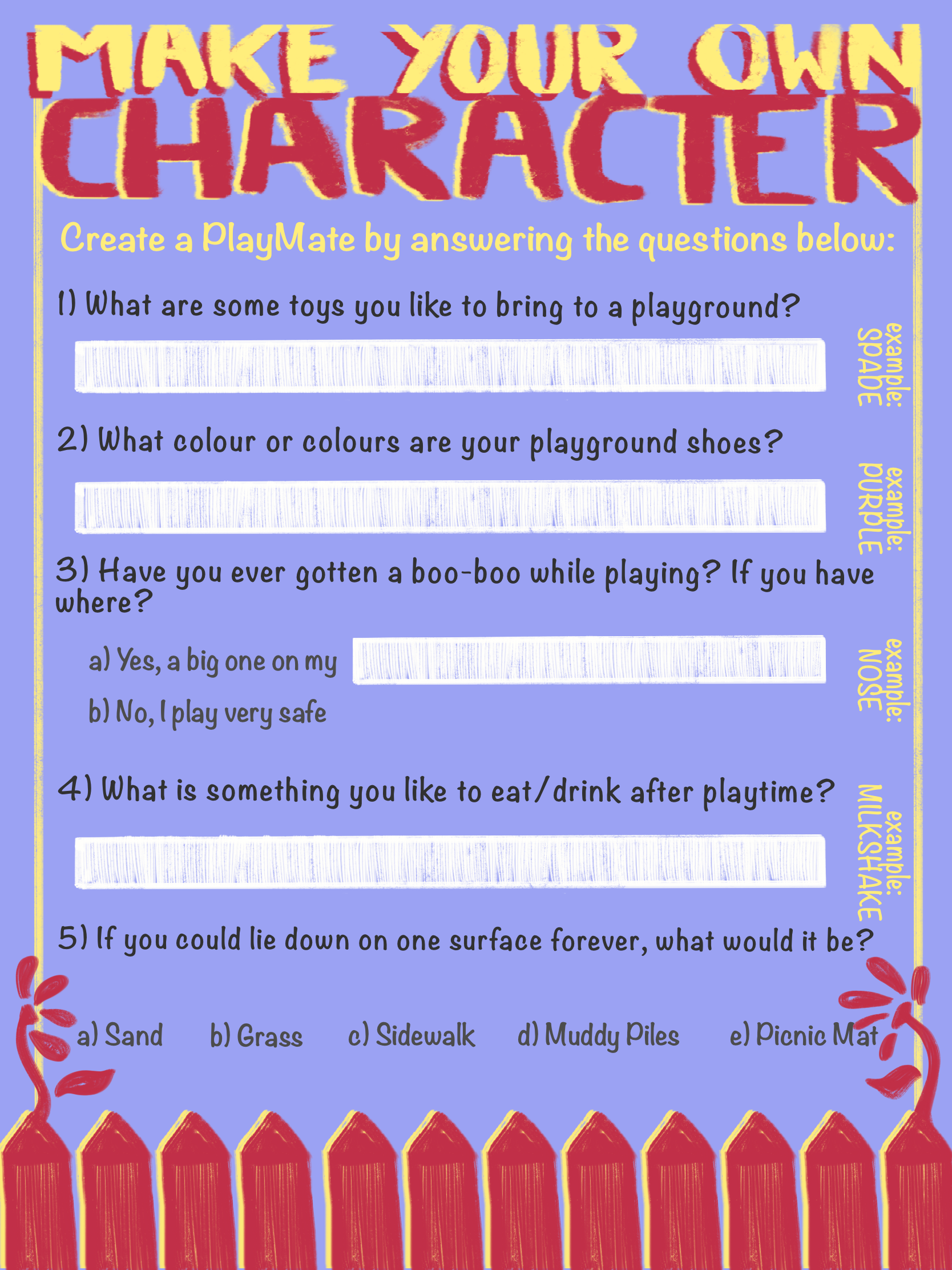
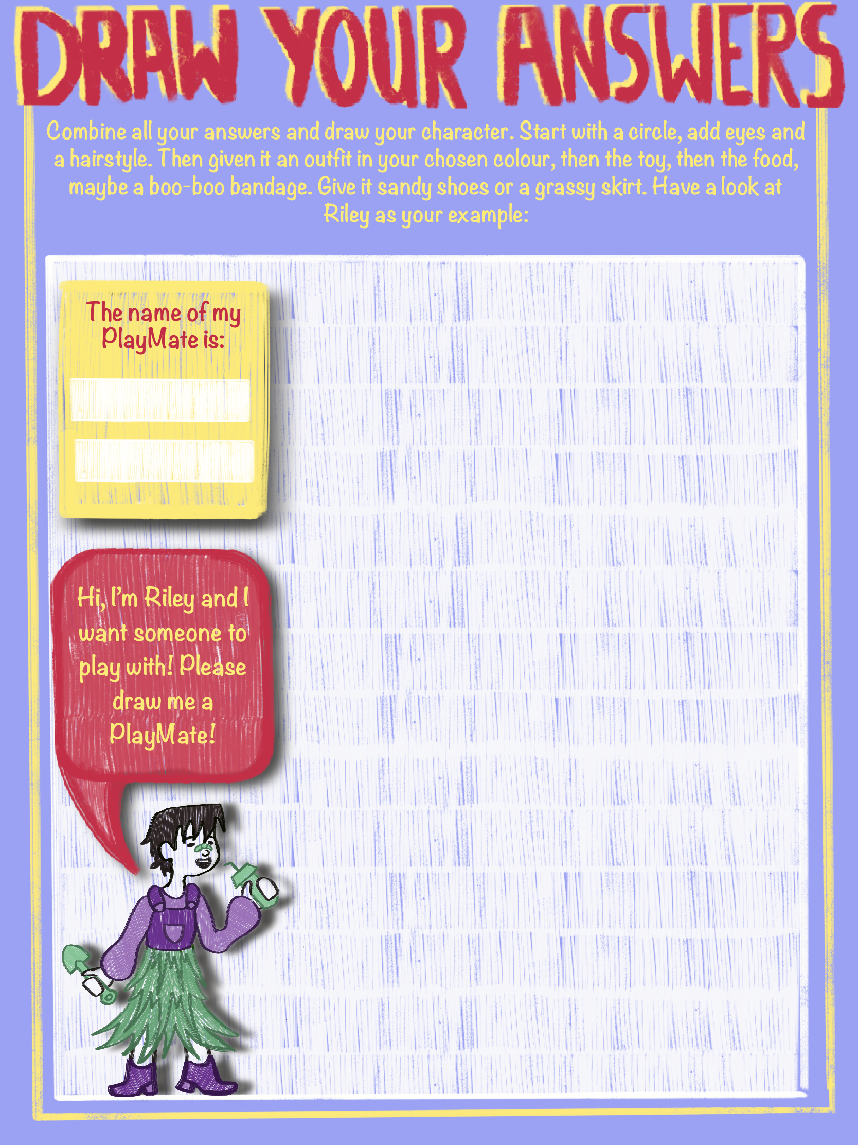
Double Page spread 1: children will answer a set of questions relating to activities in a playground. These can be ‘fill in the blanks’, MCQ’s or straightforward questions. They will then combine their answers and put them into building a character. The questions help the kids to not be too daunted by character design and makes the activity easier.
Double Page spread 2: children will take their character from before, insert them into half completed scenes and draw them doing various activities from within a playground. Not all panels will be them re-drawing their character again and again. Some panels will have them draw objects or scenes from the playground, so that it isn’t repetitive.
The second double-page spread was starting to lose its appeal for me. I felt it was becoming too complicated, especially considering how it was connected to the first task. I decided to set it aside and keep it as a backup idea, just in case.

Double Page Spread 1

Double Page Spread 2
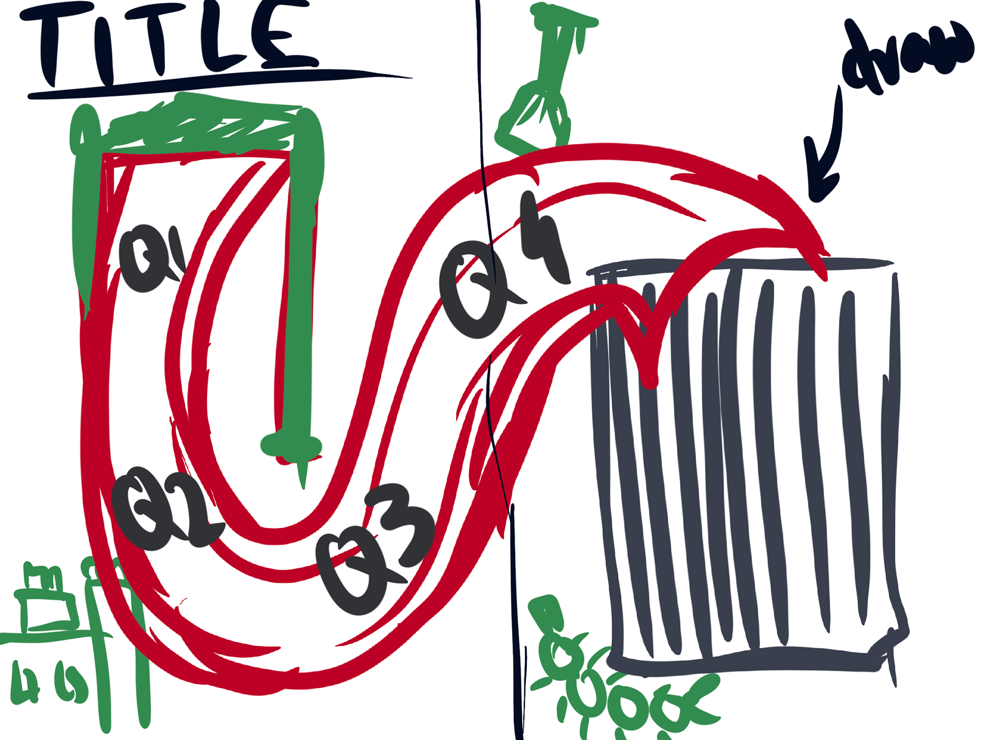
Here's me experimenting with the best layout for the idea, along with some initial attempts at choosing the right font and placing the text.
Character Design
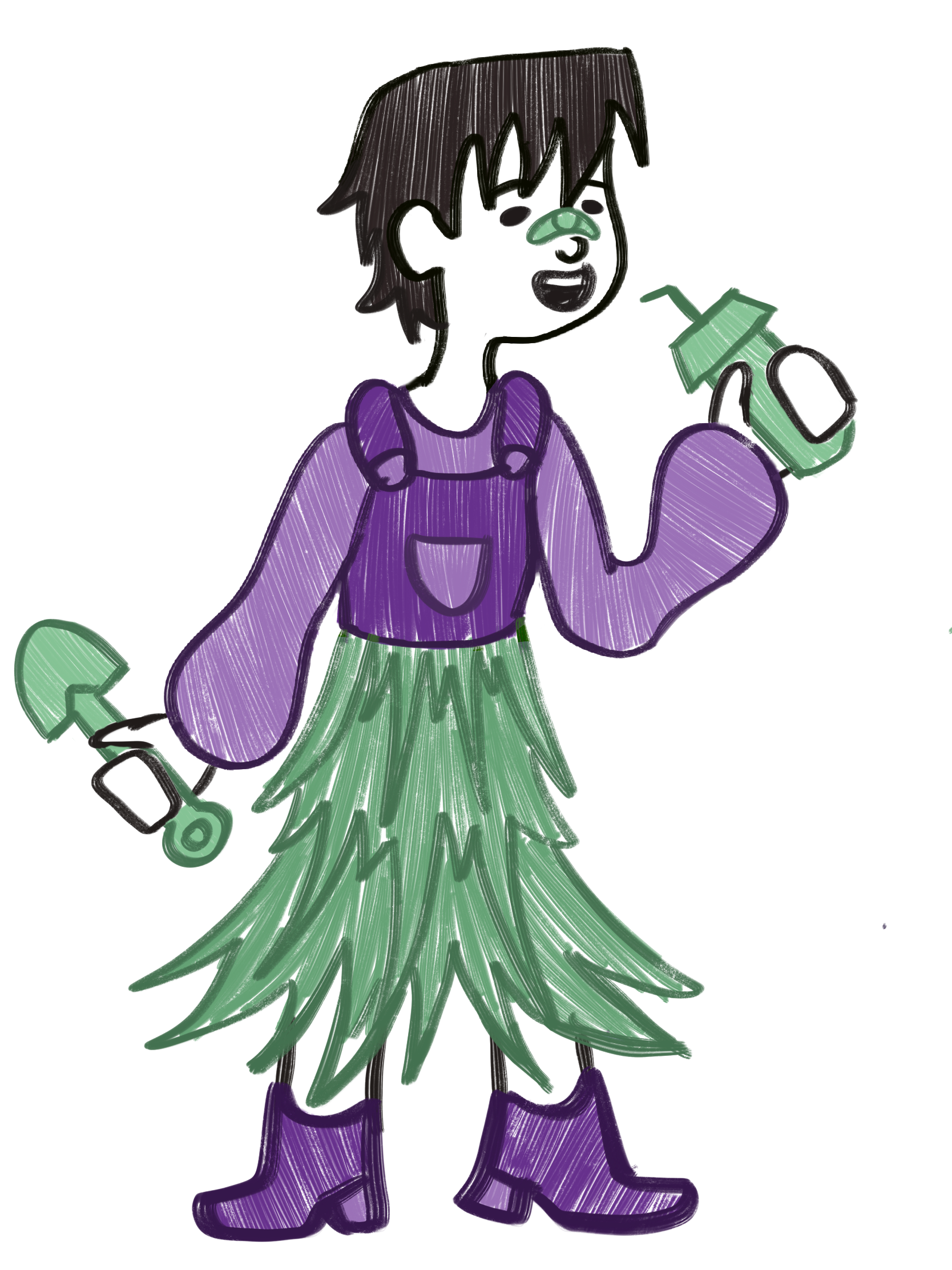
Since it's a "make your own character" task, I took a stab at creating some character designs myself. Quick, cartoony sketches aren't exactly my strongest suit, but I had a blast doodling these kids. I experimented with various options until I settled on my character, Riley.

Colour Swatches
I'm not the best at color theory, in fact, I'm probably the worst. It completely goes over my head, which is why I don't usually mess around with color swatches. However, I decided to experiment with it since I'm already trying out many new things.


Typography and Text
Text and typeface are another area where I struggle. I tried looking at some images on Pinterest for inspiration but completely failed at replicating them. However, I did know I wanted something bold and readable.


Example Questions
Here's a list of example questions I came up with to give the kids a prompt for making their characters. I tried to keep them playground-themed so I don't go off-topic. I didn't use all the questions, just the ones I liked best.
What colour/colours are your playground shoes?
An object/ride you love in playgrounds?
Toys you bring to play with?
Do you like big rides or small rides?
Food/drink you eat after playing?
Something you hate about playgrounds?
Have you ever gotten a boo-boo while playing? If you have then where?
If you could lie down on one surface forever, what would it be?
I decided to answer these questions for myself and use them as example answers next to the questions so kids have something to go off of.
Rough Template
Here's a rough template of the questions and answer box placements along with Riley and their speech bubbles.


Final Pages
Here's a look at my final two pages, fully colored. I was very happy with it, although I thought it looked very plain and textbook-like. Still, I assumed that was what was expected since a lot of the pages from Anorak follow a "two-color palette with a few illustrations" type of pattern.
Feedback Notes
Here are some main pointers and feedback I received from our first session with Anorak:
Make the idea less complicated
Add more illustrations
Switch to a more narrative approach
Re-think the questions
Re-do colour pallette
Make it feel less like a textbook
Add more figures/subjects
Focus less on title/text
Slide and Answer Idea
I decided to tweak my idea a bit. Firstly, I wanted to make it more illustrative by adding a setting and incorporating more children characters into the background to make it feel fuller. Then, I started to contemplate a new concept. I decided to either stick with the character design and question-answer format or switch it up and have the audience play a game of "roll the dice." In this game, they move forward with each roll of the dice, uniting with each of their friends across the playground. Once they've met all their friends, the finish line is them jumping into the sandpit.


The idea just wasn't coming together. Additionally, I had a very challenging week, so I was feeling unmotivated and actively disliking everything I added to this project. The art style wasn't coming through, and the lack of illustrations wasn't tying anything together
Spot the Animals Idea
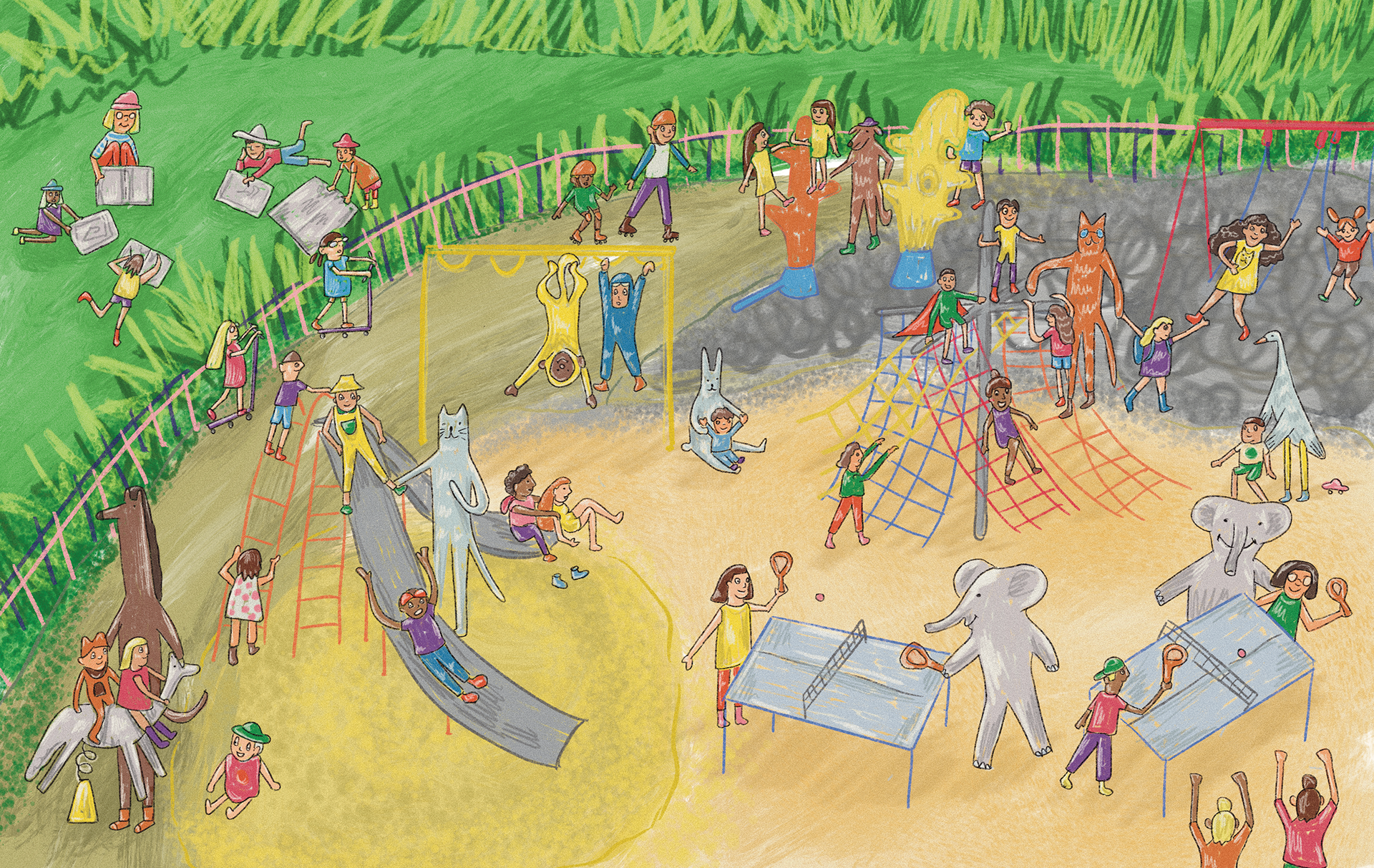
I finally accepted that the idea wasn't working out and discarded it all. I wanted to start again from scratch. With only two days left before the deadline, time was running low. I went with the easiest idea, one you'll find in most children's books: a "Where's Waldo" style game. This time, I wanted to illustrate a playground, one that was very full and crowded. I wanted to use all the little characters I had sketched out earlier and have them engaged in various activities.
Additionally, I remembered from the first presentation that many of my peers had used animals as protagonists in their projects. I'm not sure why I didn't think of that before, even though I had seen it in many books during my research. So, I decided to include some animal figures in my new idea. The concept was to play a game of "spot the animals" in a busy playground.
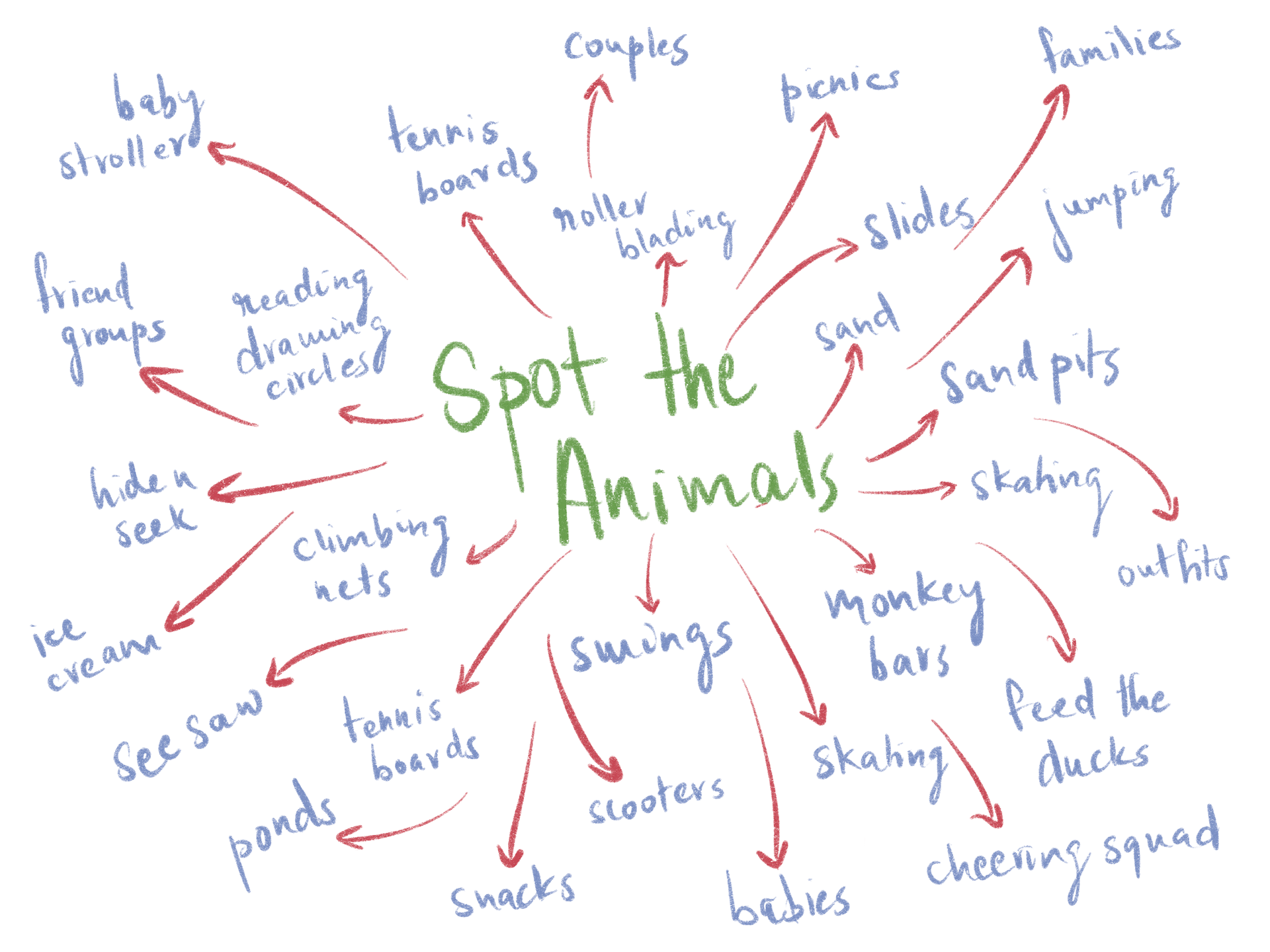
Things to add
Character Design
I started out by redesigning some of the children to ensure they all fit one cohesive style and figuring out how to draw the animals. Instead of having the animals on all fours, I decided to have them standing up on two legs to make them blend into the crowd better. Additionally, I thought it would be amusing to disguise them as "parents" and sketch them performing typical parent-like duties around the playground. I wanted to give them accessories and other human-like features.


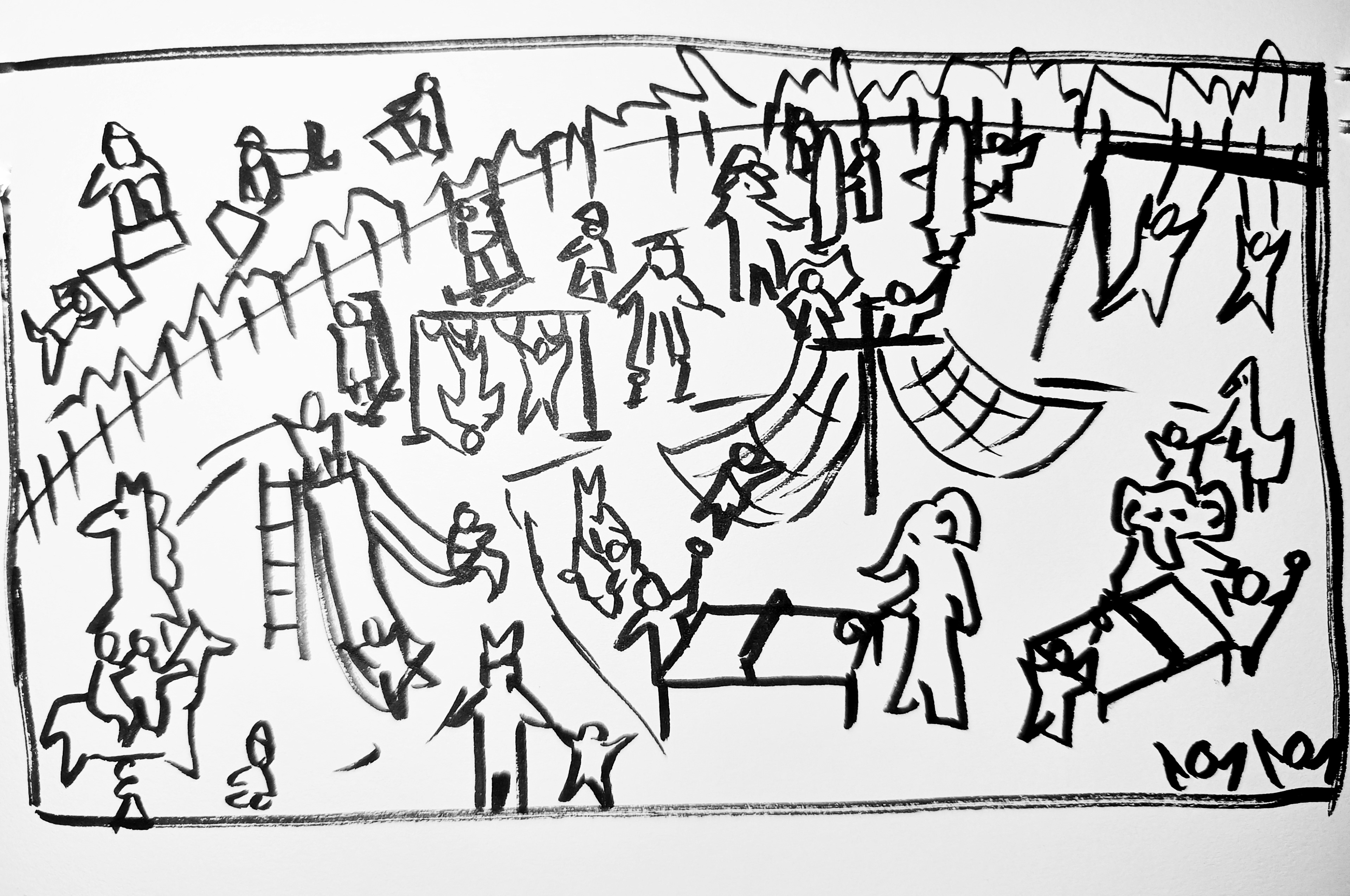
Rough Template
This is me figuring out the composition and placements of some figures and playground toys. I thought an angled bird's eye view would be able to fit in the most things. I made sure to keep the line work looking messy and thin so I could include more subjects.
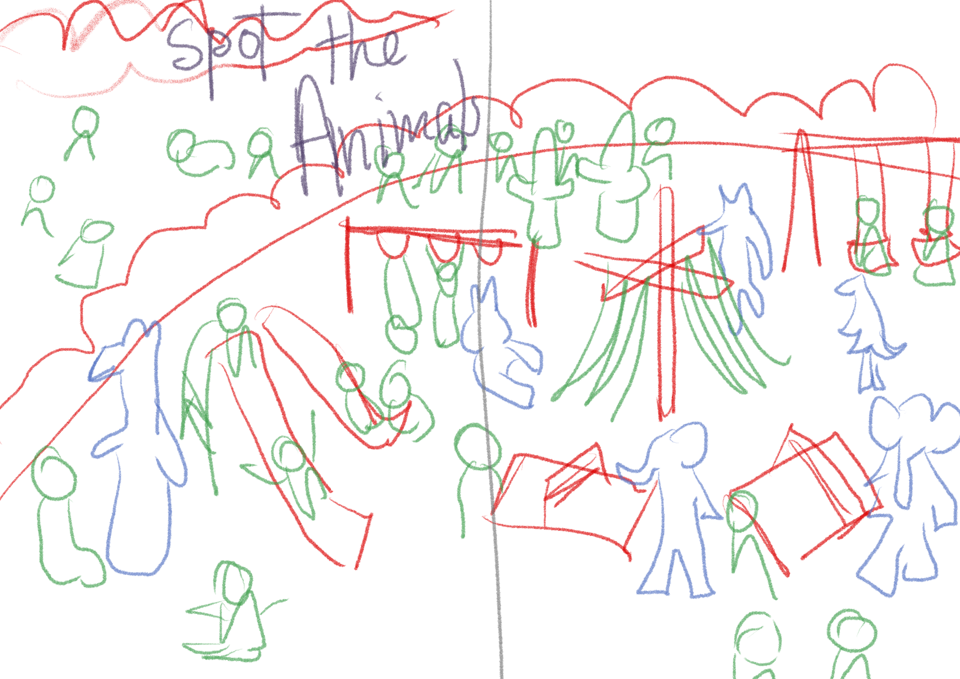
I knew I wanted the color palette to be as varied as possible. I was trying to put myself in the mind of a child and understand how they would draw such a scene. They wouldn't worry about using too many or not enough colors. The sketches are childlike and messy, and their colors run outside the lines. Despite all that, I knew a vibrant look would match these pages, so I made sure to use bright yellows and greens to keep things interesting.
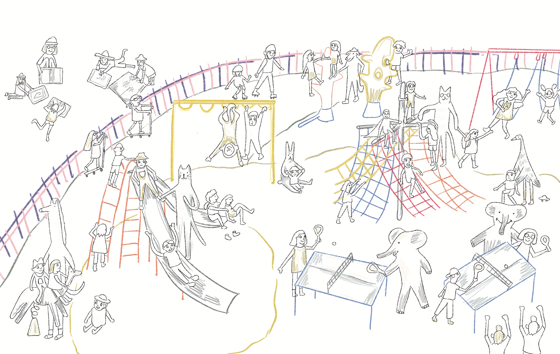
Final Work
Here's my final double-page spread. I'm actually satisfied with the outcome. I never thought I'd be able to illustrate something for children, and for some reason, it was definitely the most difficult task for me this year. But I'm glad I got to step out of my comfort zone and try something a bit more simplified.